At-A-Glance
As the Senior UX Design Manager, I led the transformation of Verizon's legacy CPQ (Configure, Price, Quote) tools into a single, unified experience. Spanning three disjointed platforms (Proquest, Sales2Go, and ViSE), this redesign aimed to simplify workflows, improve accuracy, and accelerate deal velocity for thousands of users including Sales Reps, Solution Architects, and Order Managers.
Understanding the Problem
End User Problems
Difficulty navigating complex filters and unclear terminology
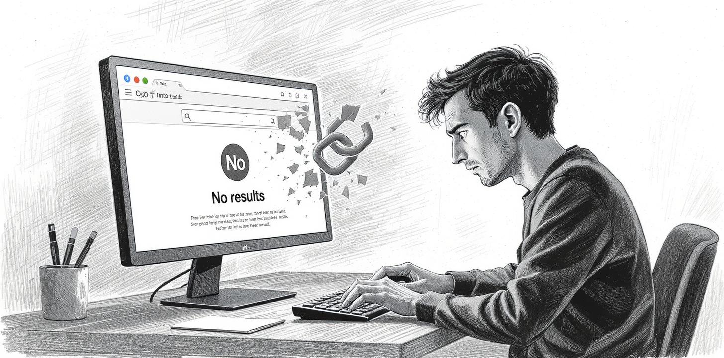
Inability to locate relevant partners due to zero search results or limited filters
Frustration from lack of mobile optimization and inconsistent UI patterns
Unclear next steps: partner profiles lacked trust signals, structure, and strong CTAs
Business Problems
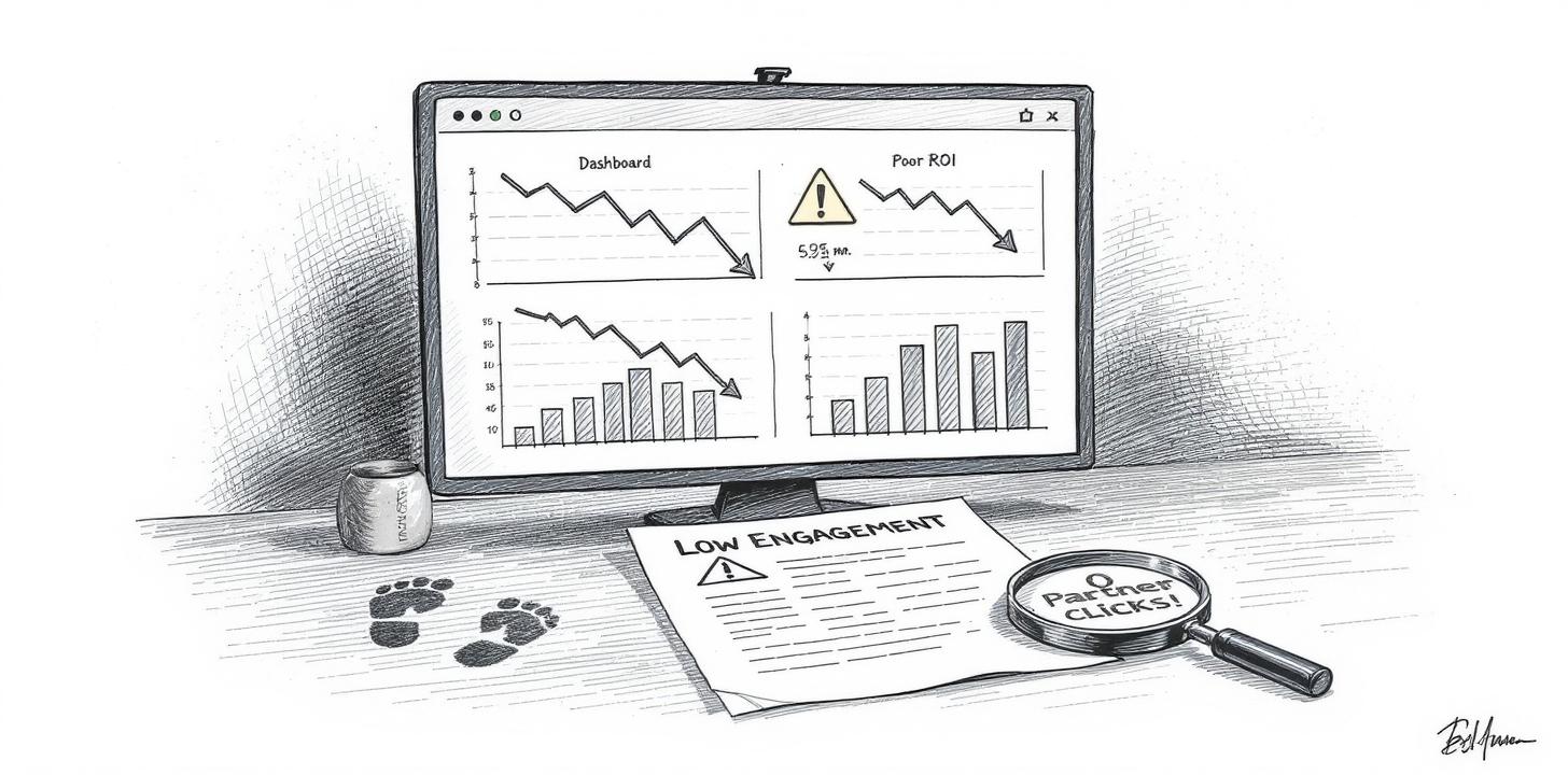
Low engagement and conversion metrics impacting partner visibility and ROI
High abandonment on mobile, limiting reach to on-the-go enterprise users
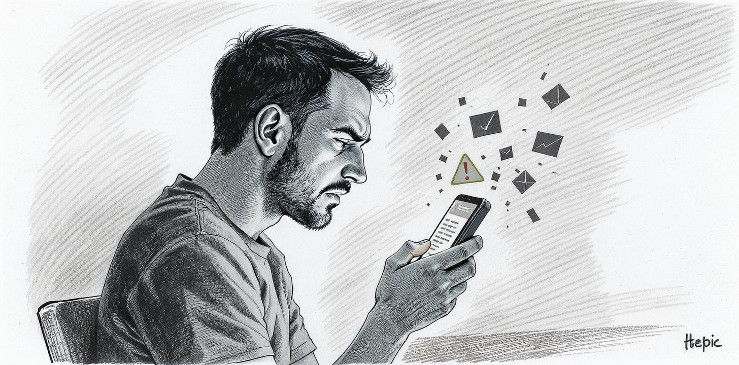
Negative perception due to lack of responsiveness or partner follow-up
Underutilized program value due to poor discoverability of Dell's partner ecosystem
Results at a Glance
Engagement increased 2.5x; Conversion rate more than doubled
Partner satisfaction improved with better visibility and lead quality
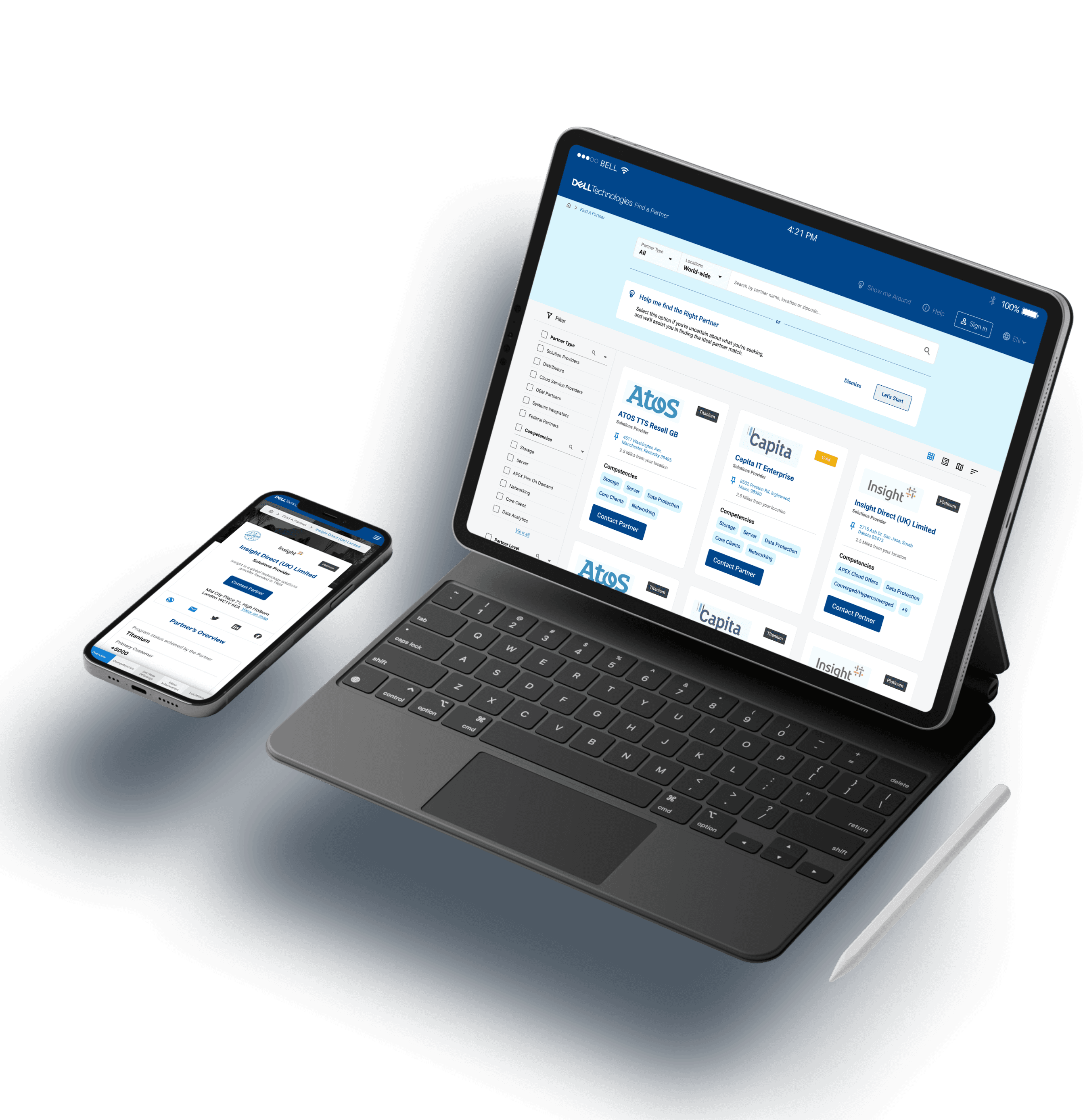
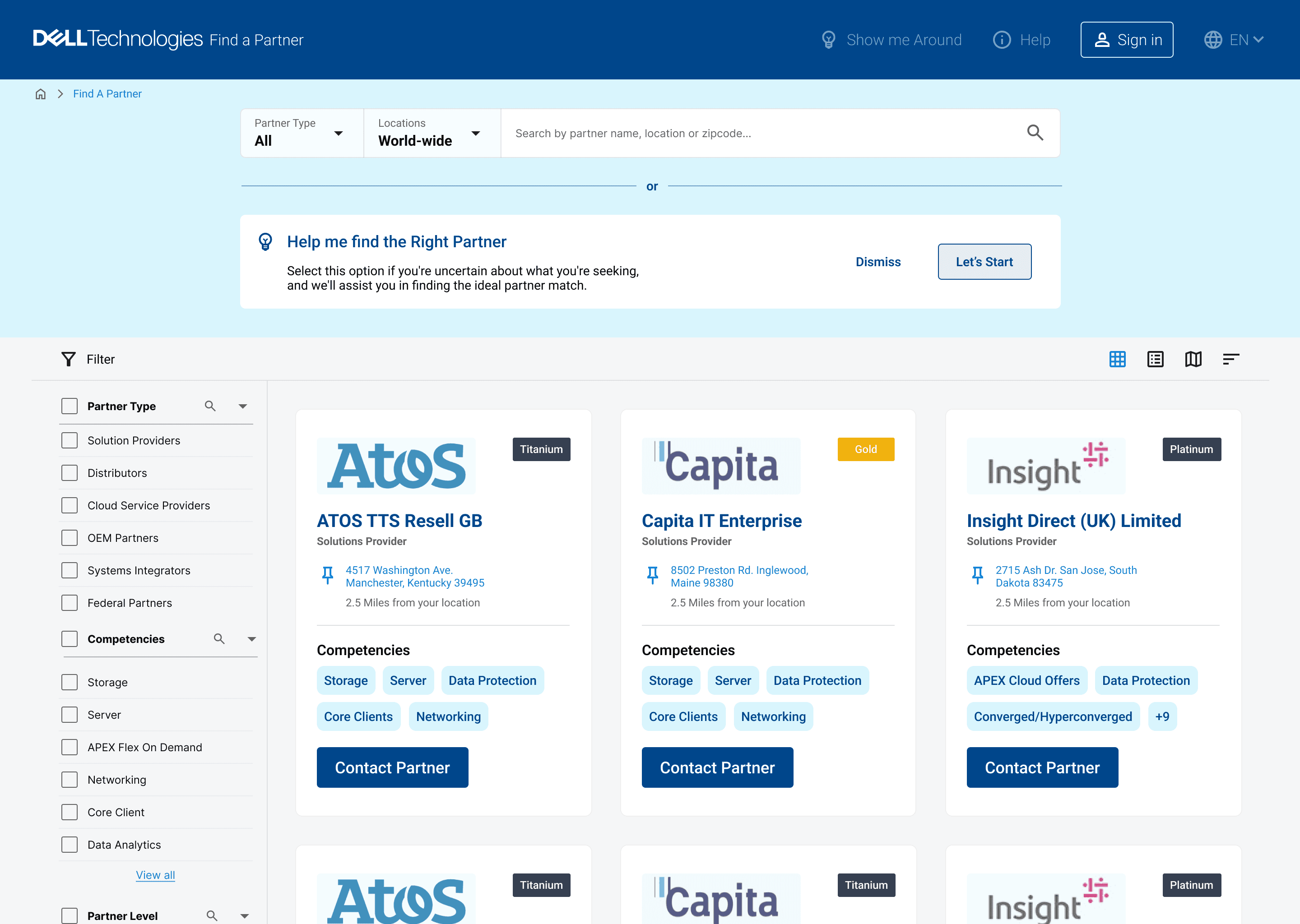
FAP Redesign – Process & Timeline
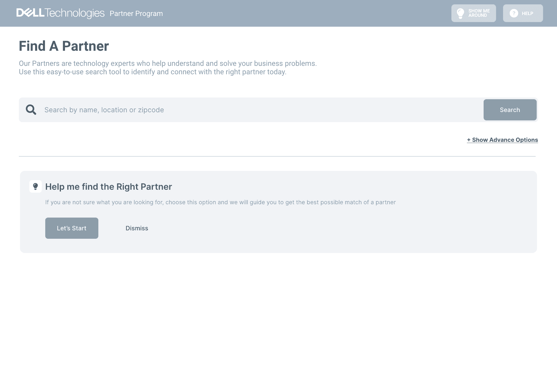
Redesign Dell's Find a Partner (FAP) platform to streamline partner discovery, improve user engagement, and align with business growth objectives.
How did we approach the problem
When we were on-boarded to Dell FAP project, Dell had already conducted user research. So we began by analysing and synthesising the user research data collected which involved reviewing the existing experience and identifying key insights, pain points, and opportunities for improvement.


What We Heard from Users
We conducted qualitative interviews and usability walkthroughs with Dell stakeholders and end users across SMBs, IT departments, and channel sales.
View User Persona
Research Analysis
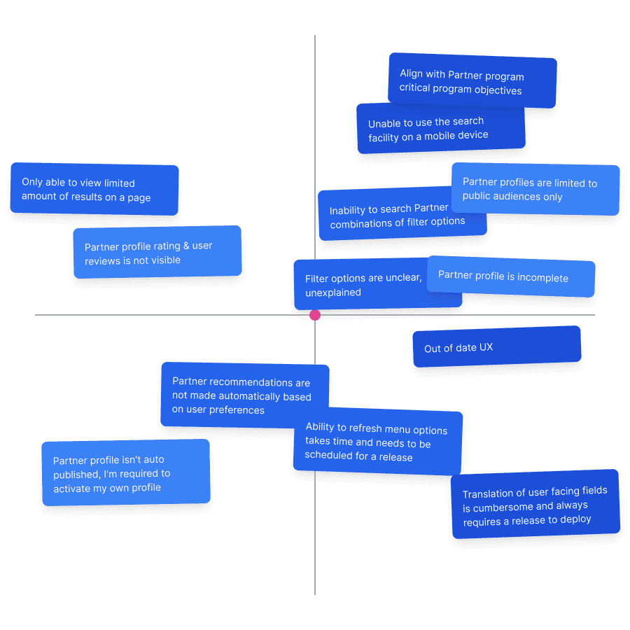
By analyzing the data collected from user interviews, we were able to identify the needs, pain points, and opportunities for improvement. Using this information, we created a Problem Prioritization matrix to determine which issues to address first and focus our efforts on solving the most critical problems.
User Experience Map - Dell Find a Partner Tool
Visualization of user journey comparing ideal path vs. path with issues

During the research synthesis phase, we created a comprehensive user experience map based on live usability testing and stakeholder interviews. This helped us visualize how users ideally moved through the platform — and where they struggled.
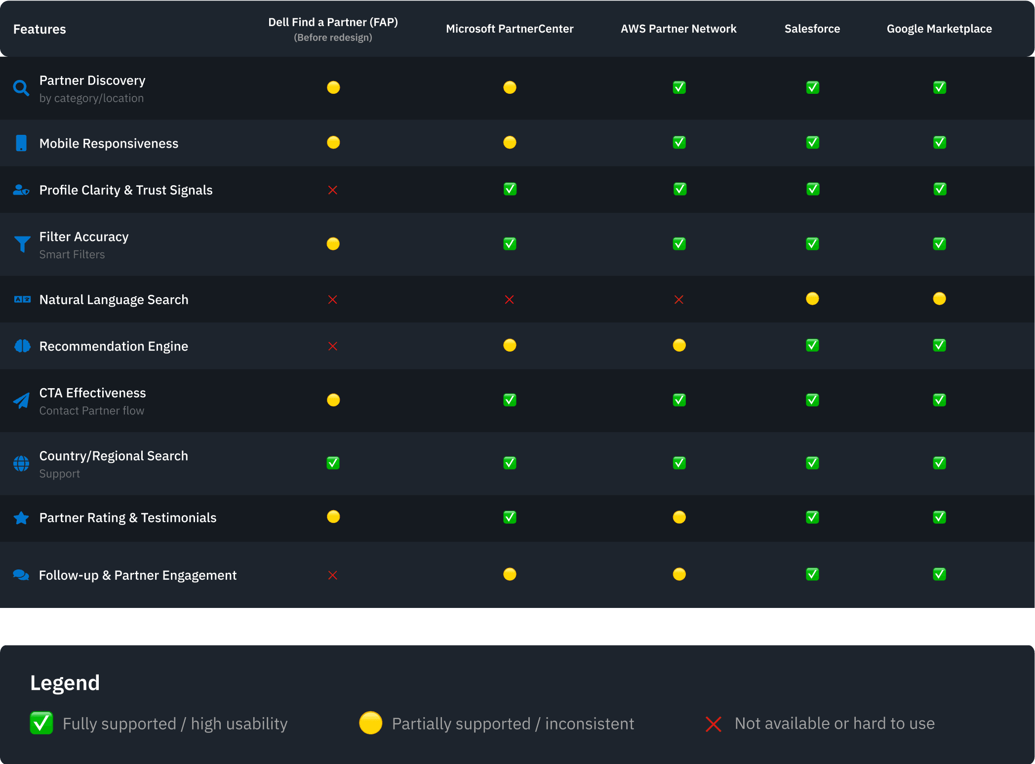
Competitive Benchmarking
To assess Dell FAP’s position in the B2B partner discovery space, we benchmarked it against platforms like Salesforce, AWS, Microsoft Partner Center, and Google Cloud.
We compared performance across 10 key UX dimensions including search accuracy, mobile readiness, and profile clarity.
What we found
Dell FAP lagged in profile clarity, recommendation intelligence, and partner follow-up.
Salesforce and AWS outperformed with refined UX, smart filters, and trust-building features.
FAP’s strengths — country-level search and broad partner reach — were offset by poor UI and inconsistent CTAs.
This analysis guided our redesign priorities and served as a benchmark for elevating FAP to enterprise standards.
Relative Market Share
Cash Cows
Stars
Questio Marks
24
16
8
0.0
0.0
1.2
Google
Marketplace
Salesforce
AWS Partner
Network
HP Partner
First
Cisco Partner
Channel
Lenovo Partner
Hub
Microsoft Partner
Center
IBM Find a
Business Partner
Dell FAP
User Study
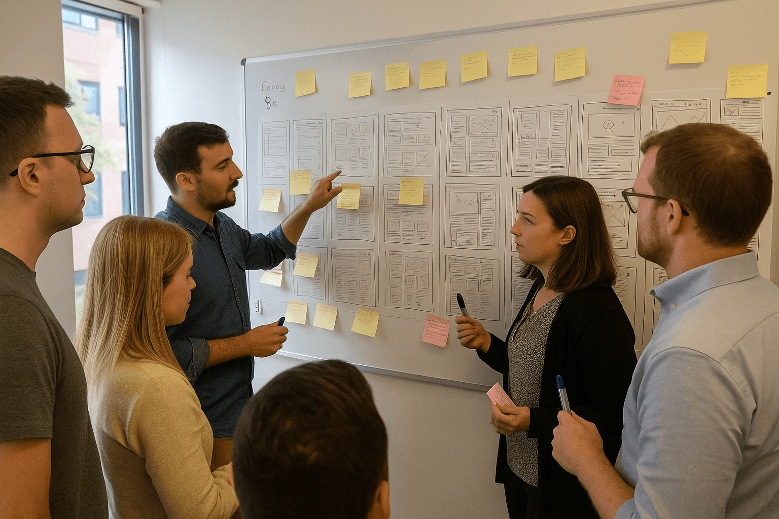
To turn our research insights into actionable design directions, we kicked off the ideation phase with collaborative workshops.
We began with Crazy 8s sketching sessions to generate a wide range of ideas—some practical, some exploratory—to solve core user frustrations. Participants included product managers, designers, and engineers, helping us capture multiple perspectives.
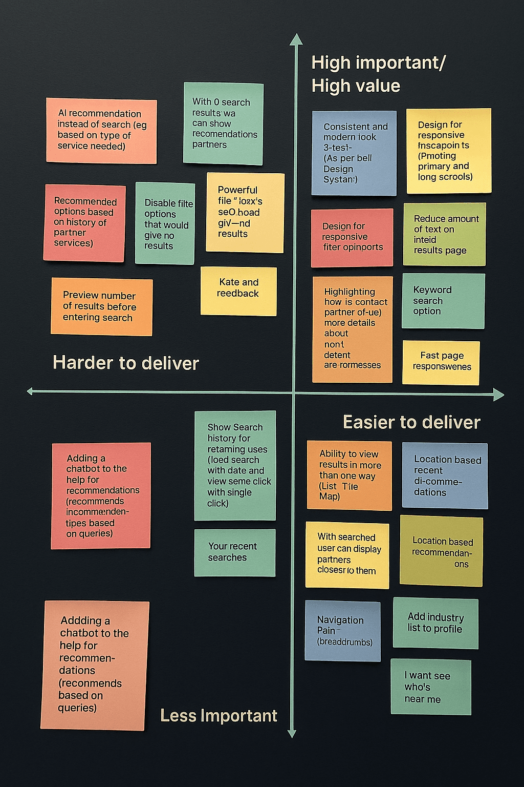
2x2 Prioritization Matrix
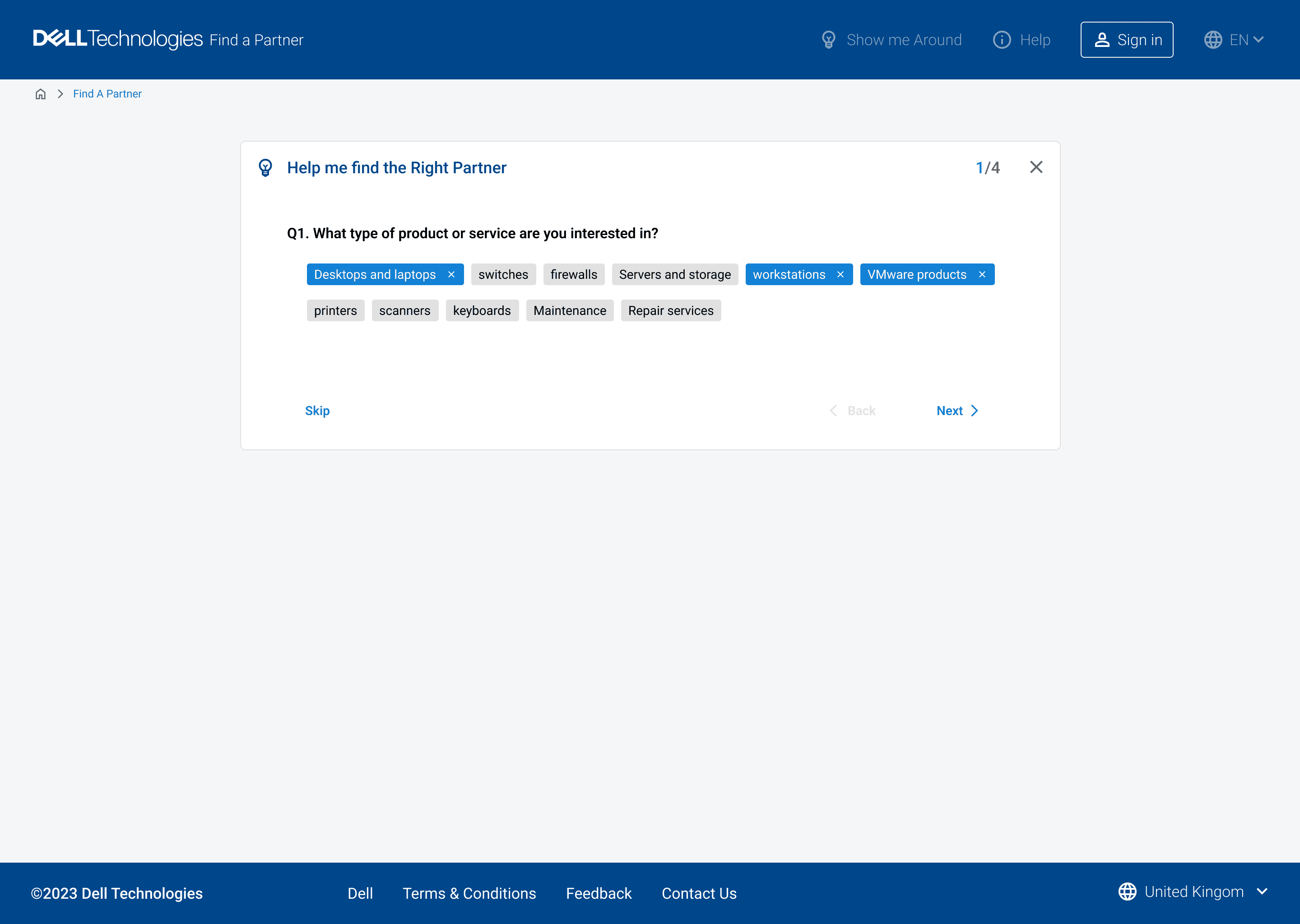
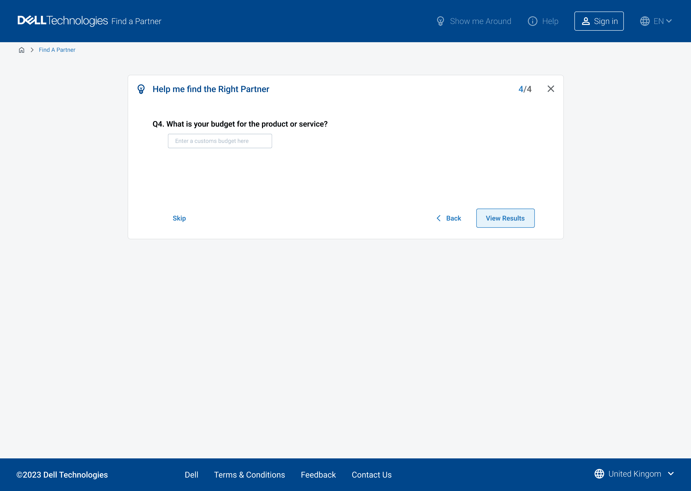
We used a 2x2 Prioritization Matrix to evaluate ideas based on effort and business/user value. This helped us identify high-impact, achievable improvements—such as implementing keyword search, enabling location-based partner recommendations, introducing predictive filters, and streamlining results for faster discovery with fewer steps.
Outcome of the activitty
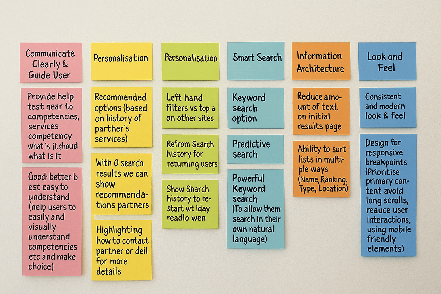
Based on this exercise, we aligned on three early design focus areas
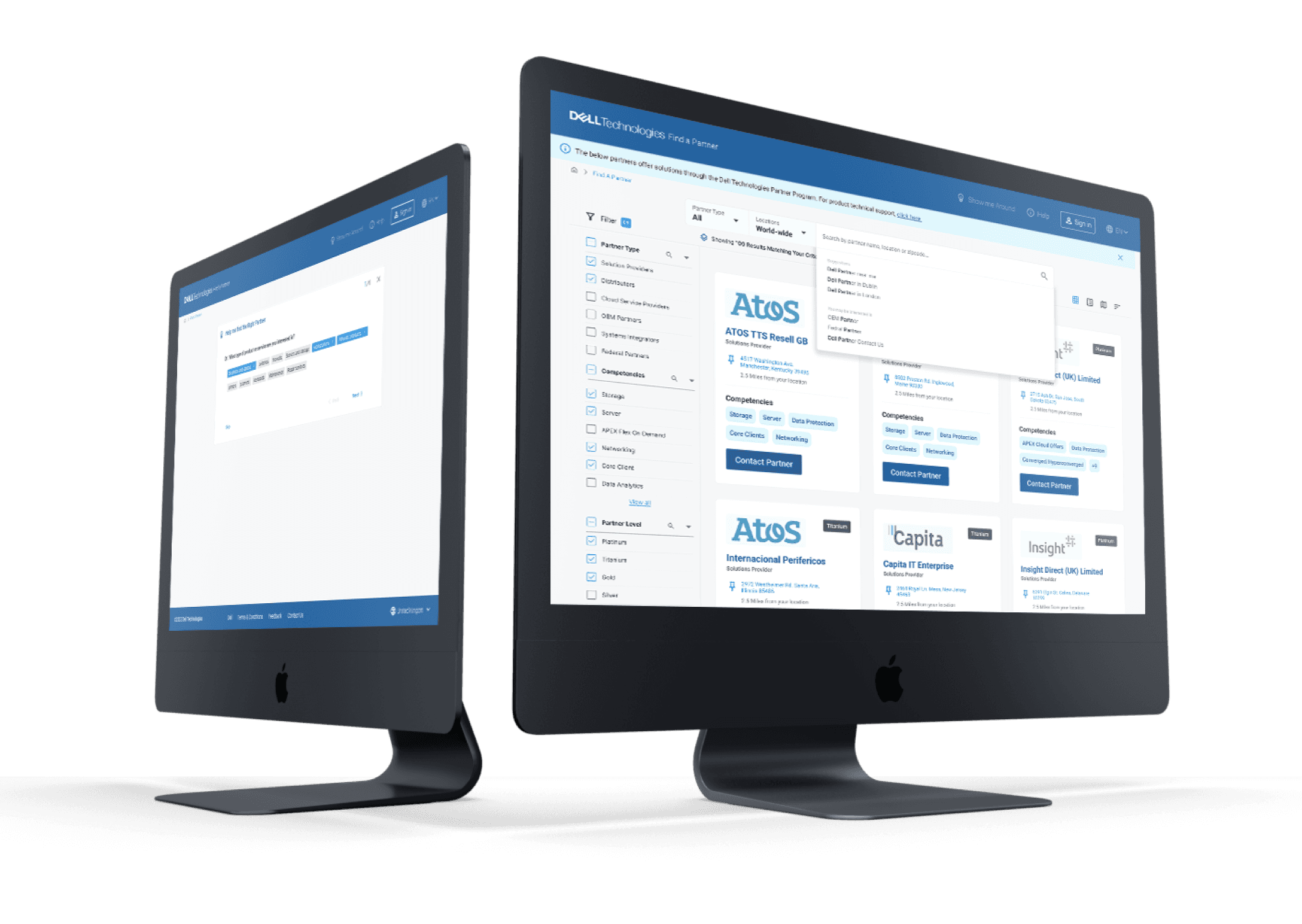
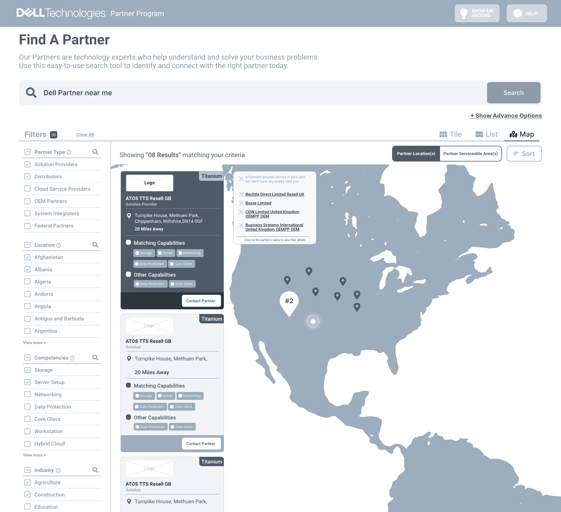
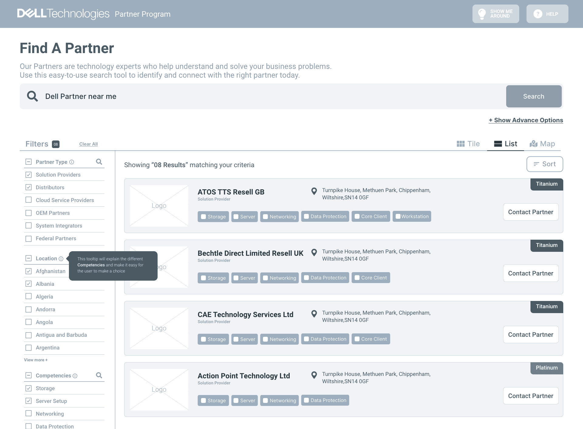
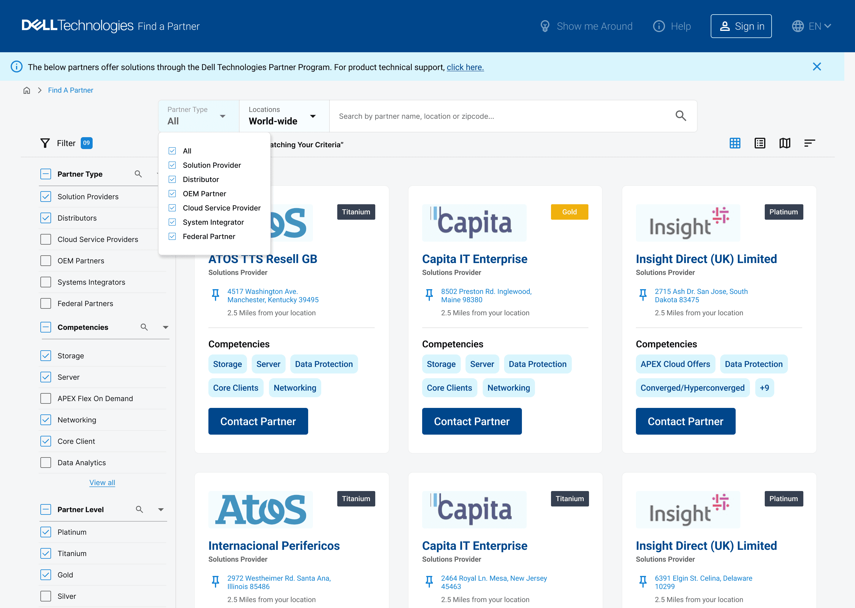
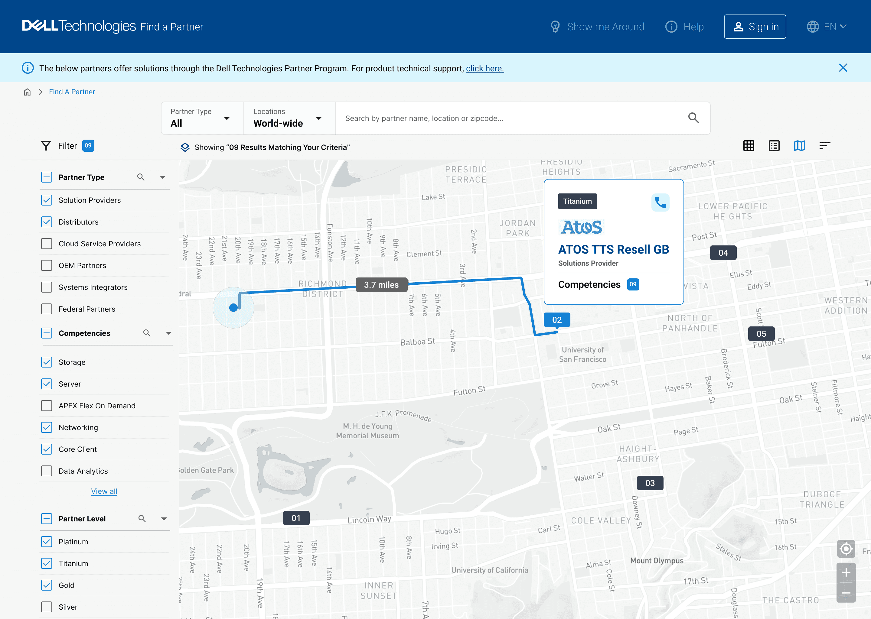
Make search smarter – with filters, sorting, and multi-view support (grid, list, map)
Improve visual design and mobile usability – to reduce bounce and improve session time
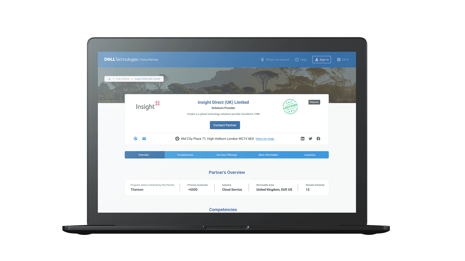
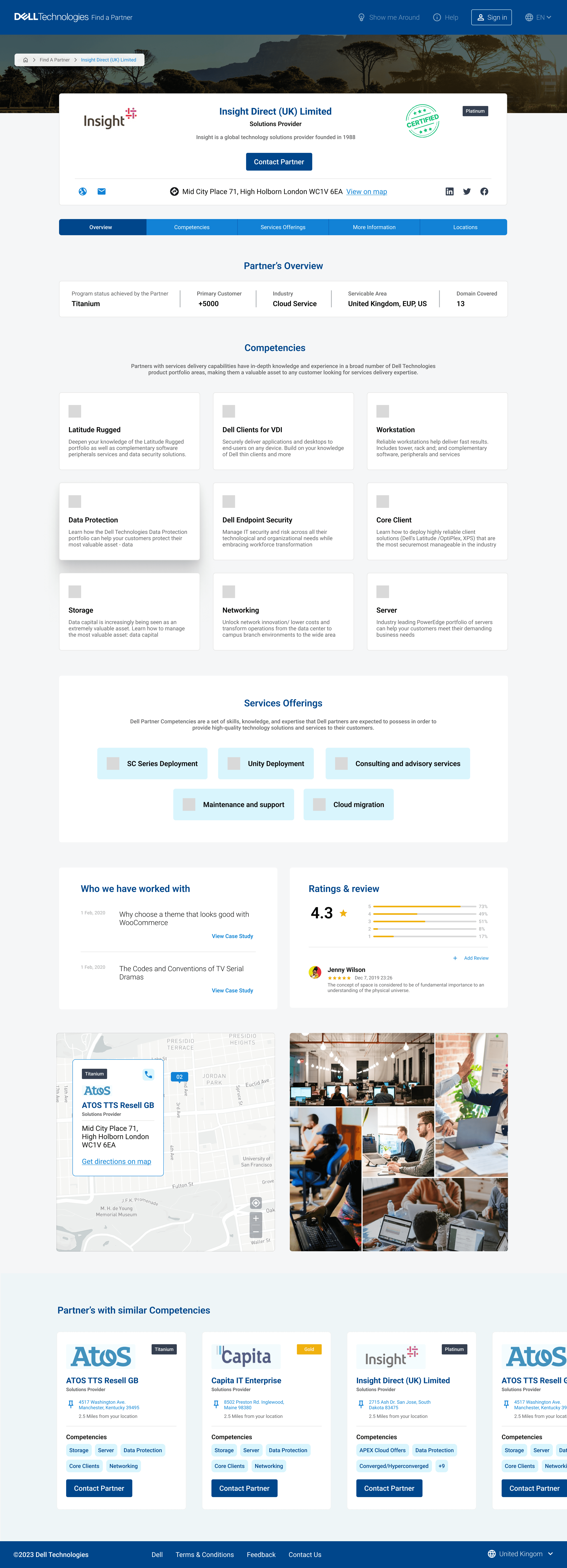
Redesign partner profile architecture – to clearly communicate value and prompt action
With priorities in place, we mapped the Information Architecture and Task Flows to streamline navigation and support key actions like search, compare, and contact. We also created concept wireframes to validate and finalize the design direction.
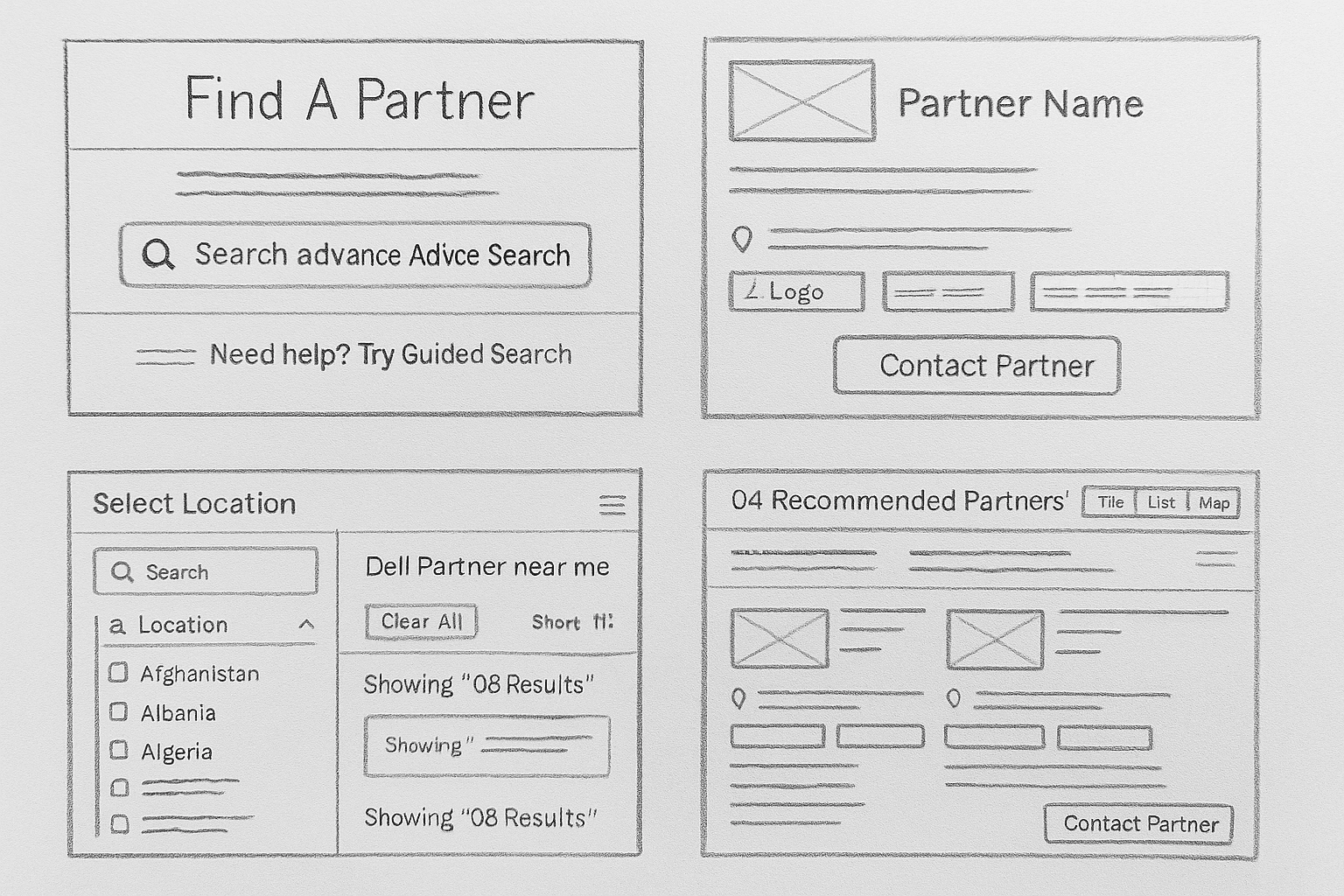
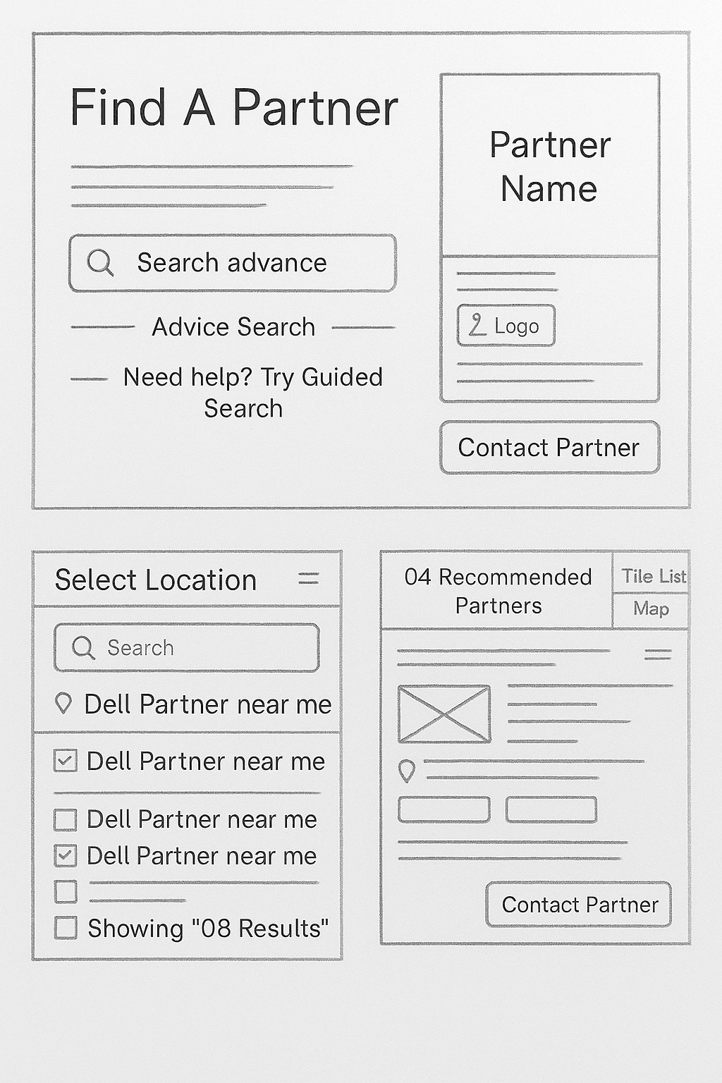
View Information Architecture
Designing the solution
After conducting extensive research and gathering insights from stakeholders and users, we established experience principles that aligned with the core goals of the FAP project. These principles guided our design decisions and ensured that the product was designed to meet the needs of both users and the business. The four principles we identified were:

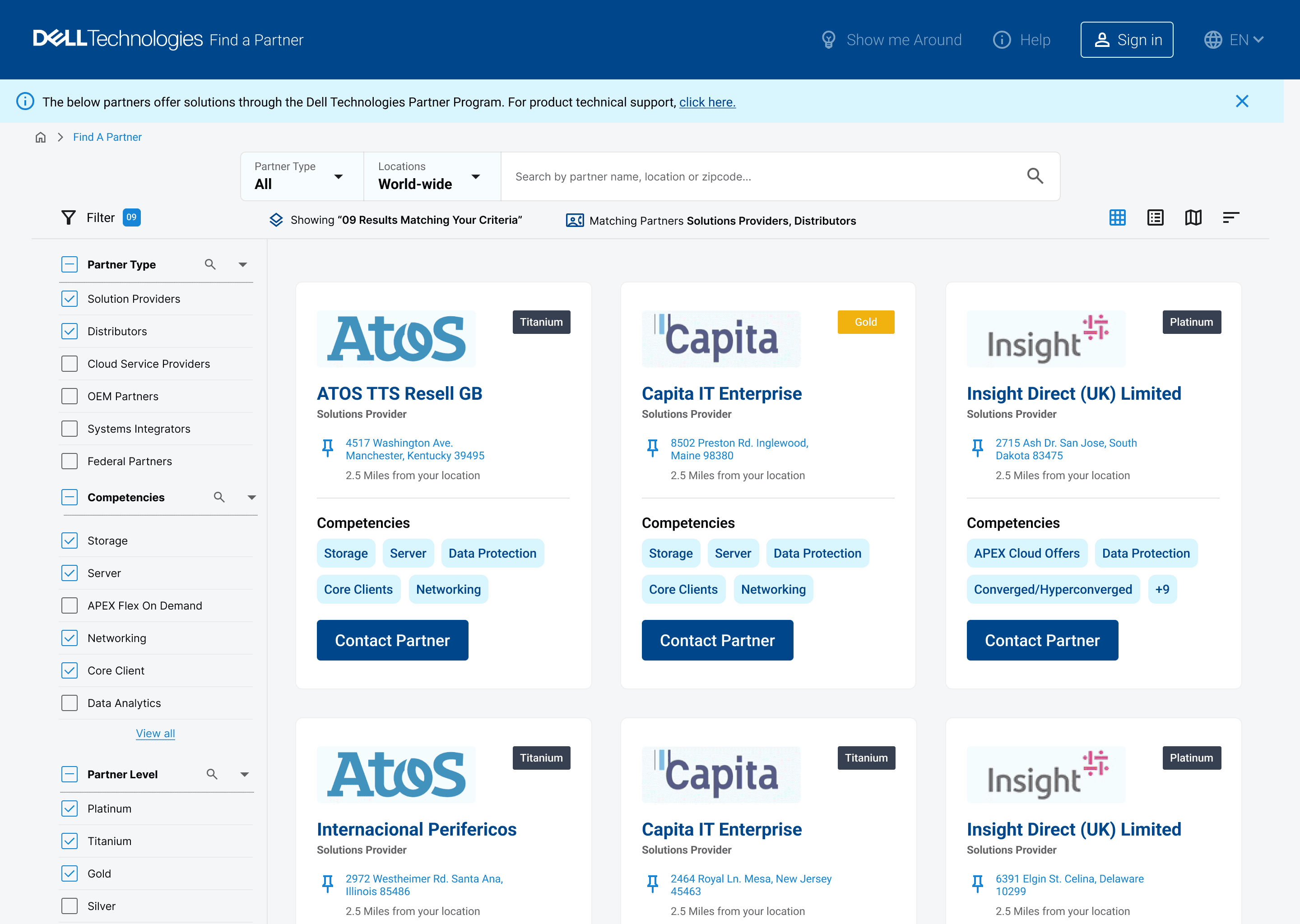
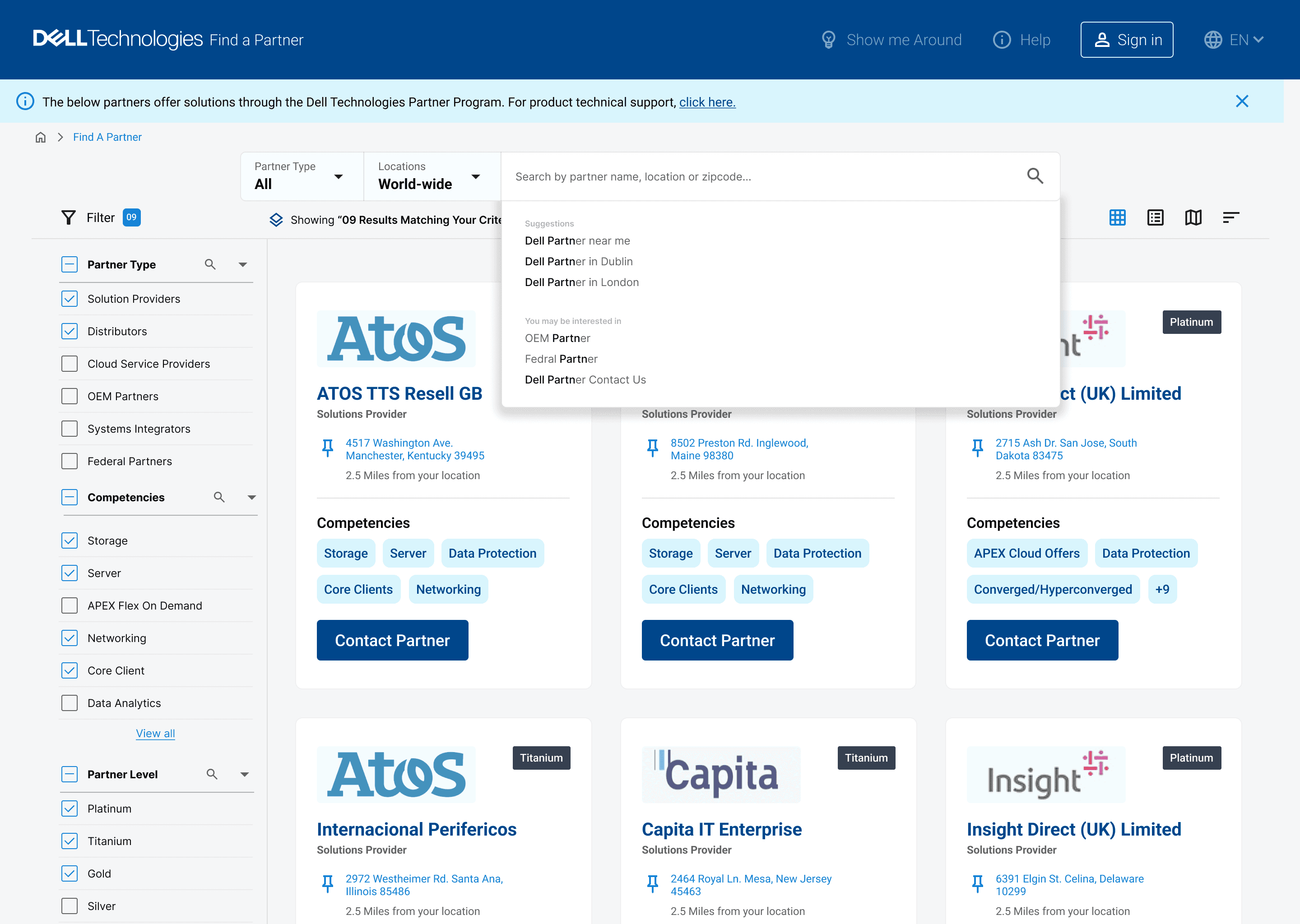
What we improved
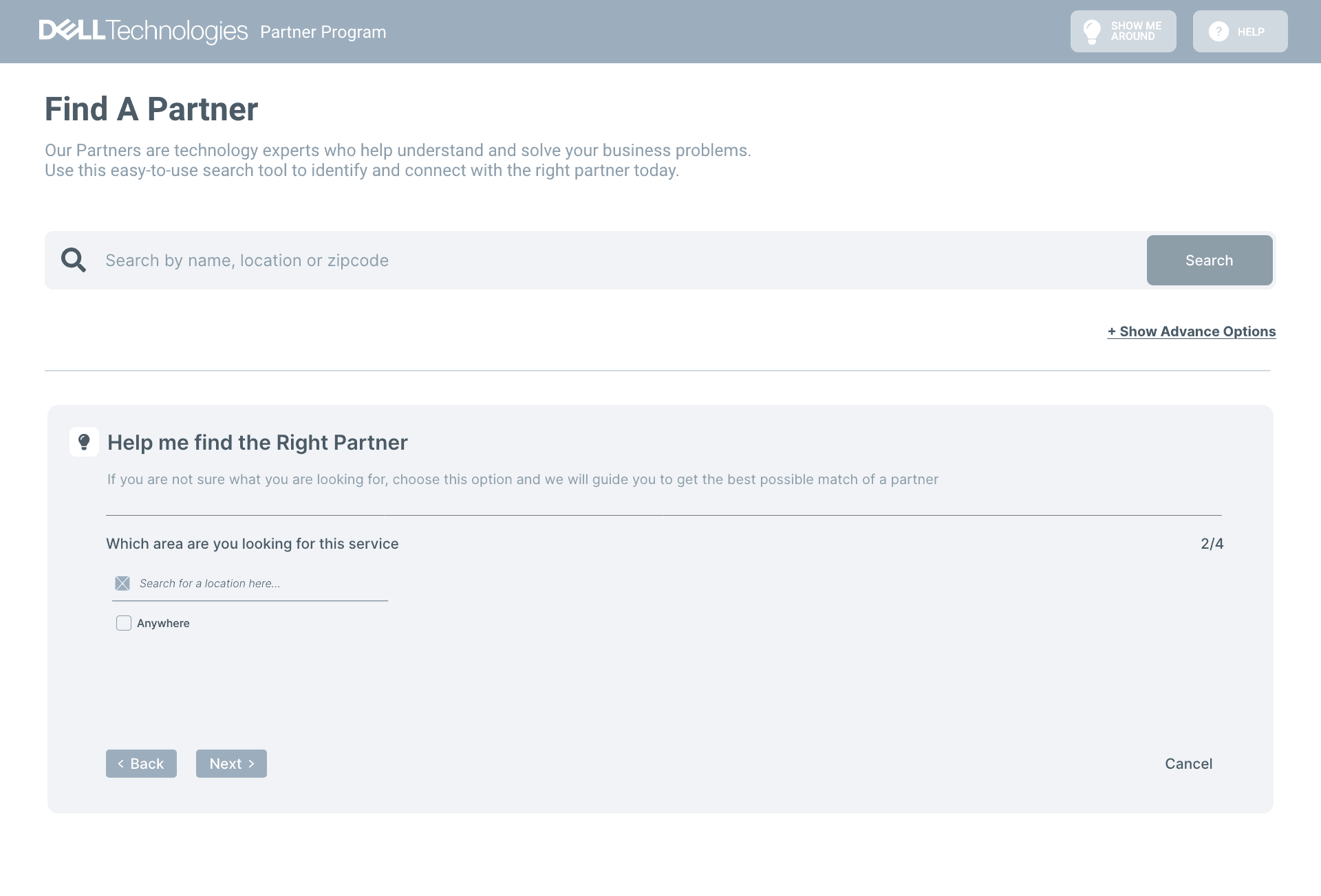
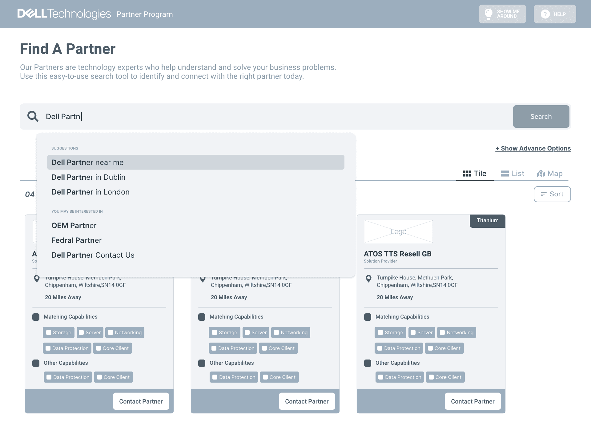
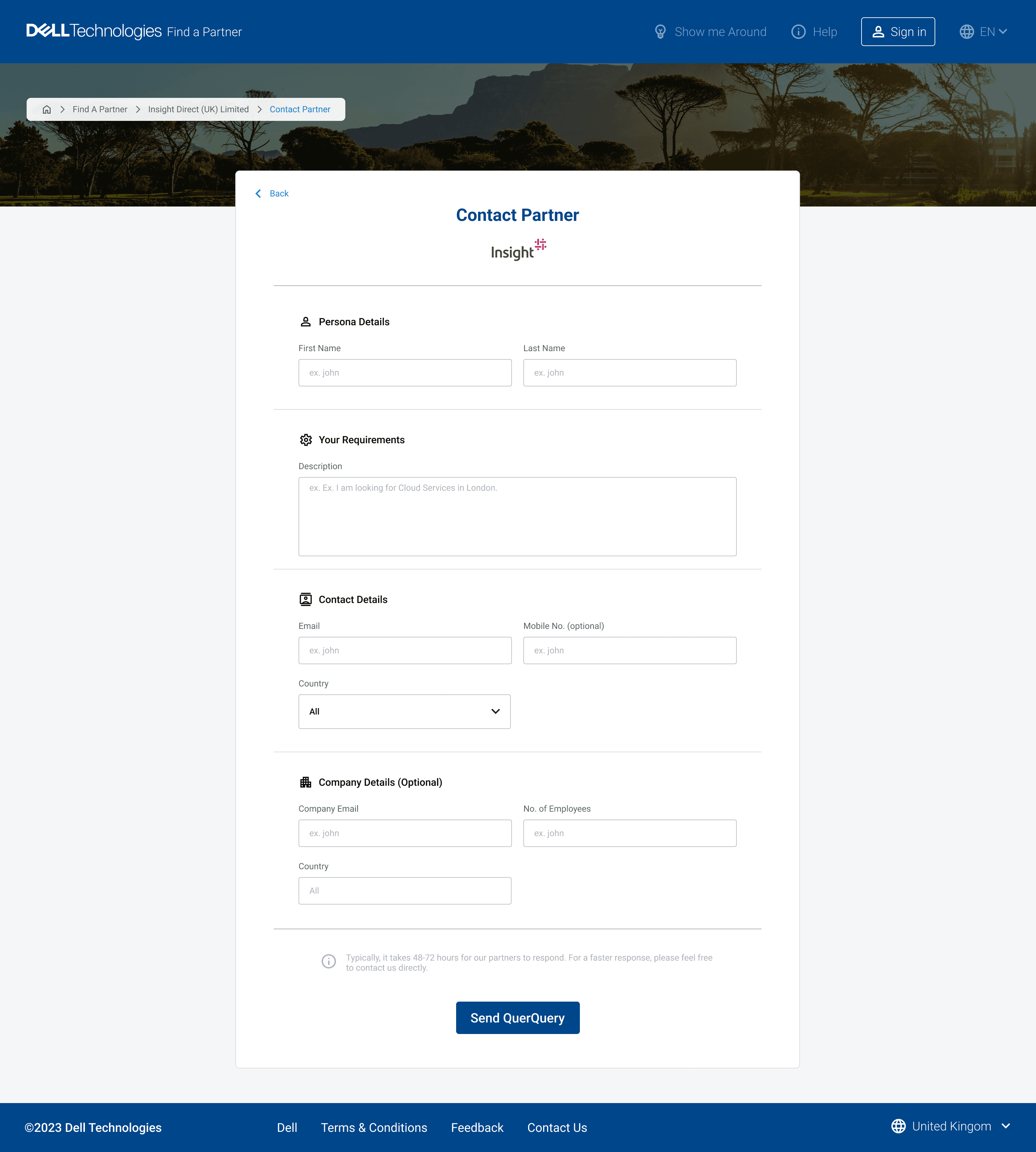
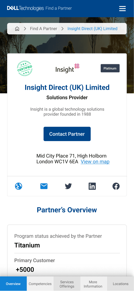
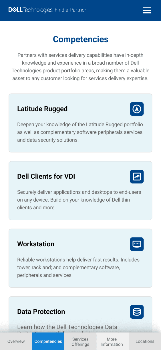
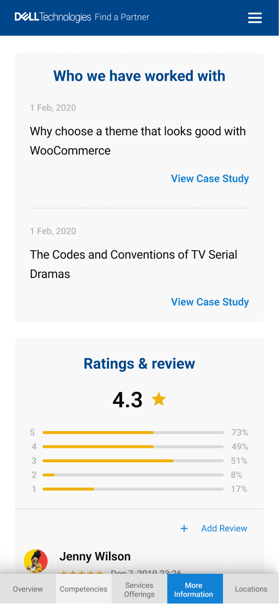
Wireframes

Visual Designs
Outcome & Measured Impact
2.5x
20%
2.3 min
11%
Future Opportunities
AI-driven recommendations based on search and behavior
Multilingual rollout and country-level customization
Integrating partner response tracking to close the feedback loop
Final Reflection
This case study showcases how strategy-led design and cross-functional collaboration can elevate underperforming enterprise tools into customer-centric platforms that drive results.
As a design leader, I believe in solving for clarity, trust, and conversion—not just screens. FAP’s transformation was not only a UX success but a business enabler for Dell’s global partner ecosystem.