
Redesigning SBSA’s Business Online Portal
At-A-Glance
"I just need to see my balances quickly, but it feels like solving a puzzle every time.”
— Maria, Treasury Manager, SBSA user
That quote shaped everything. The legacy BOL system worked — but it worked like a maze. Our mission was clear: bring clarity, speed, and delight to the Consolidated Balances module — and through it, the financial decision-making process for business users.
Problem to Solve
The legacy system presented significant friction for business users trying to manage financial data efficiently.
Tasks required too many clicks (avg. 4–6 per action)
Terminology was misaligned with business users
No easy path to consolidated financial overviews
What was needed:
A faster, smarter, and more intuitive way to manage financial groupings, tailored for busy business users (SMEs, Finance Managers, Treasury).
Outcome
I led a redesign that reduced task time by 30%, modernized legacy navigation, and empowered over 3K business users.
Business Objective

Redesign the platform to be intuitive, fast, and intelligent — improving access to consolidated balances, reducing time-to-task, and supporting high-value decision-making.
Research & Discovery
To guide our IA and UX overhaul, we began with foundational research across qualitative and quantitative methods. We mapped out findings visually to uncover thematic pain points and patterns.


Usability Testing Findings
Participants struggled with core tasks:
Heuristic Evaluation Highlights
We conducted a detailed heuristic evaluation based on Jakob Nielsen’s 10 Usability Heuristics, identifying critical gaps that impacted the discoverability, efficiency, and satisfaction within the legacy Consolidated Balances interface. Each issue was assigned a severity rating (Low, Medium, High) based on frequency, impact, and persistence.
View full Document
Competitive Benchmarking Insights
We reviewed the digital banking platforms of top competitors including Nedbank, FNB, and Absa to understand how they present financial summaries, support account consolidation, and design for usability.
This competitive analysis validated opportunities we saw from testing and heuristics:

These insights were integrated directly into our prioritized design concepts and IA restructuring roadmap.
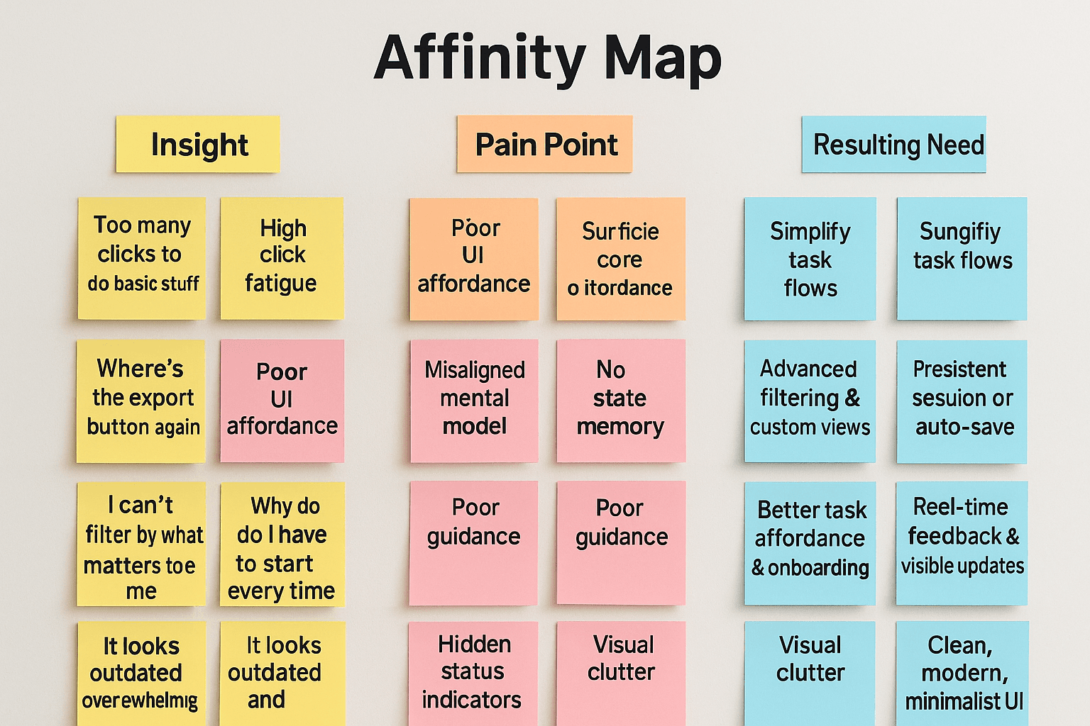
Insight Affinity Map
We consolidated observations from interviews and testing into a sticky-note-style affinity map. Each color-coded cluster revealed user pain points, behavior triggers, and unmet needs. This exercise allowed us to group patterns:
Ideation & Solution Strategy
To tackle the key usability challenges, we conducted two structured ideation workshops with cross-functional teams. These sessions allowed us to explore a wide range of creative solutions grounded in real user needs.
SCAMPER Method
We used SCAMPER to challenge the status quo of the legacy interface. For example:
Substitute: Replaced 4+ step navigation flows with a simplified left-hand layout
Combine: Unified export and alert actions into a single access point
Adapt: Applied progressive disclosure from consumer dashboards to ease complexity
Eliminate: Removed confirmation steps that stalled task flow

How Might We (HMW) Exercises
We translated user frustrations into focused design opportunities. These HMW statements aligned the team around solvable goals,

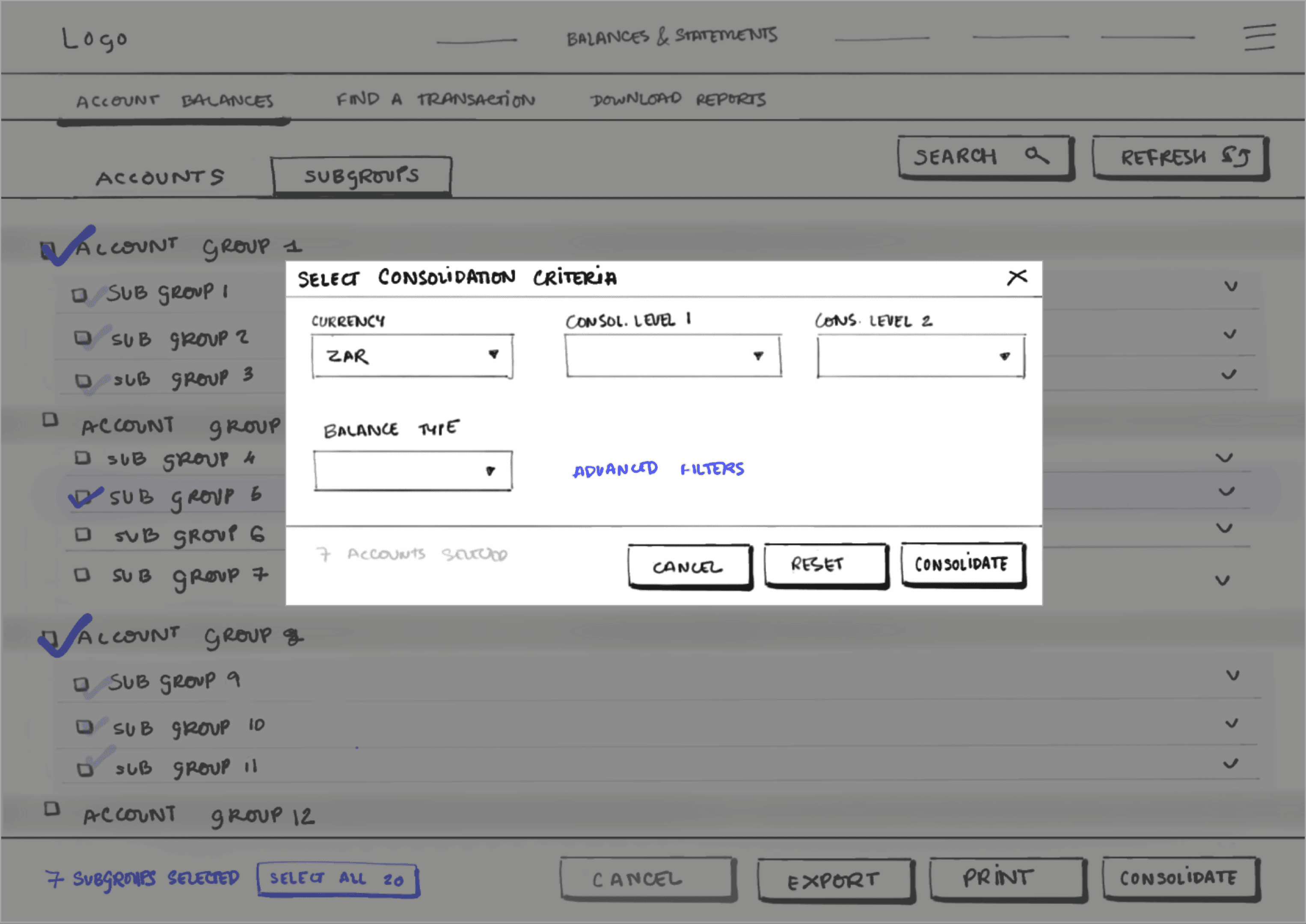
Design Studio (Sketch + Critique)
We conducted low-fidelity sketching rounds, followed by rapid peer critique. Each round helped:
Visualize ideas quickly
Align on core flows like account selection, filtering, and exporting
Refine navigation hierarchy using user-first labeling
Outputs from these sessions directly informed wireframes and supported fast iteration.

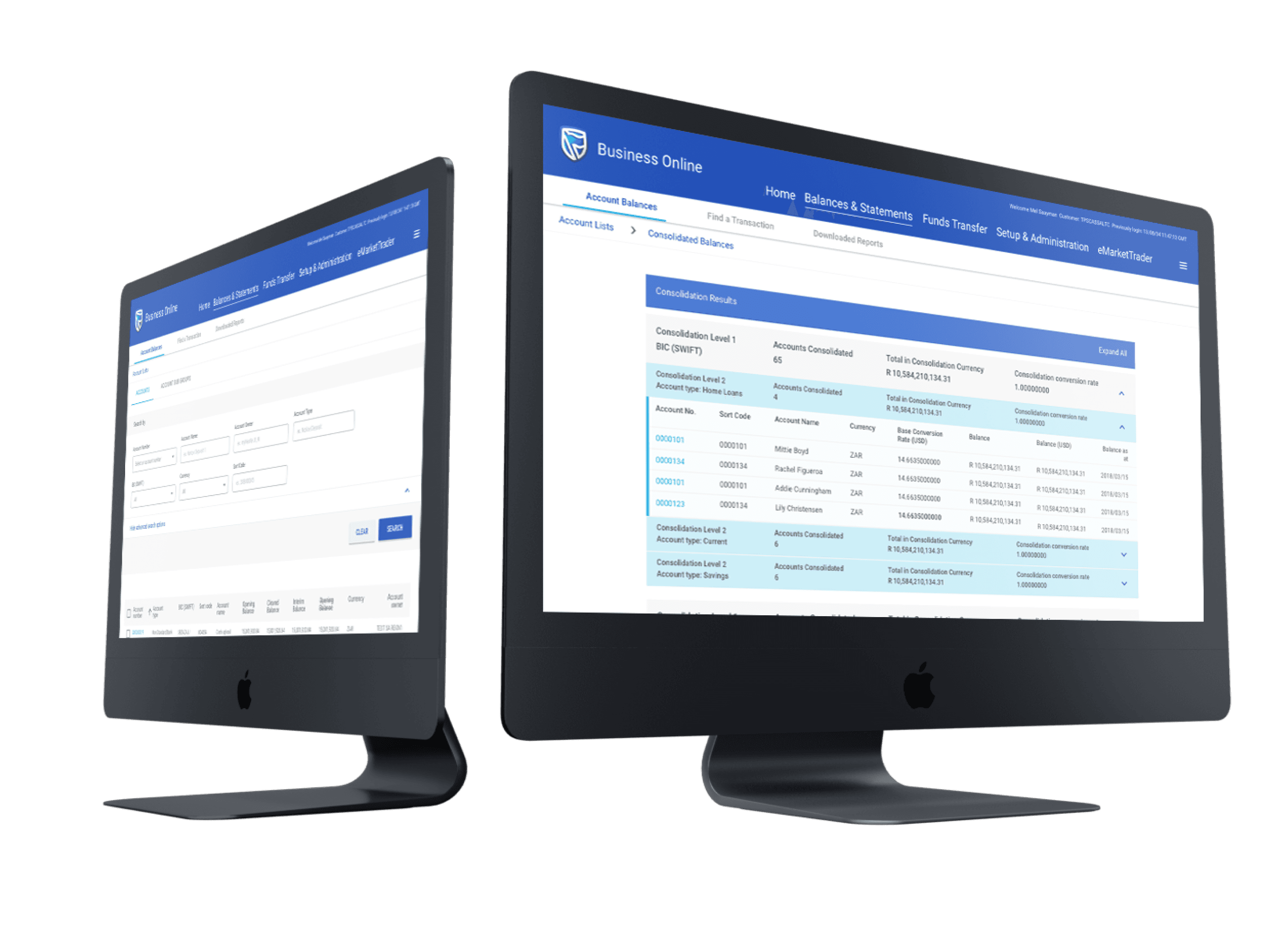
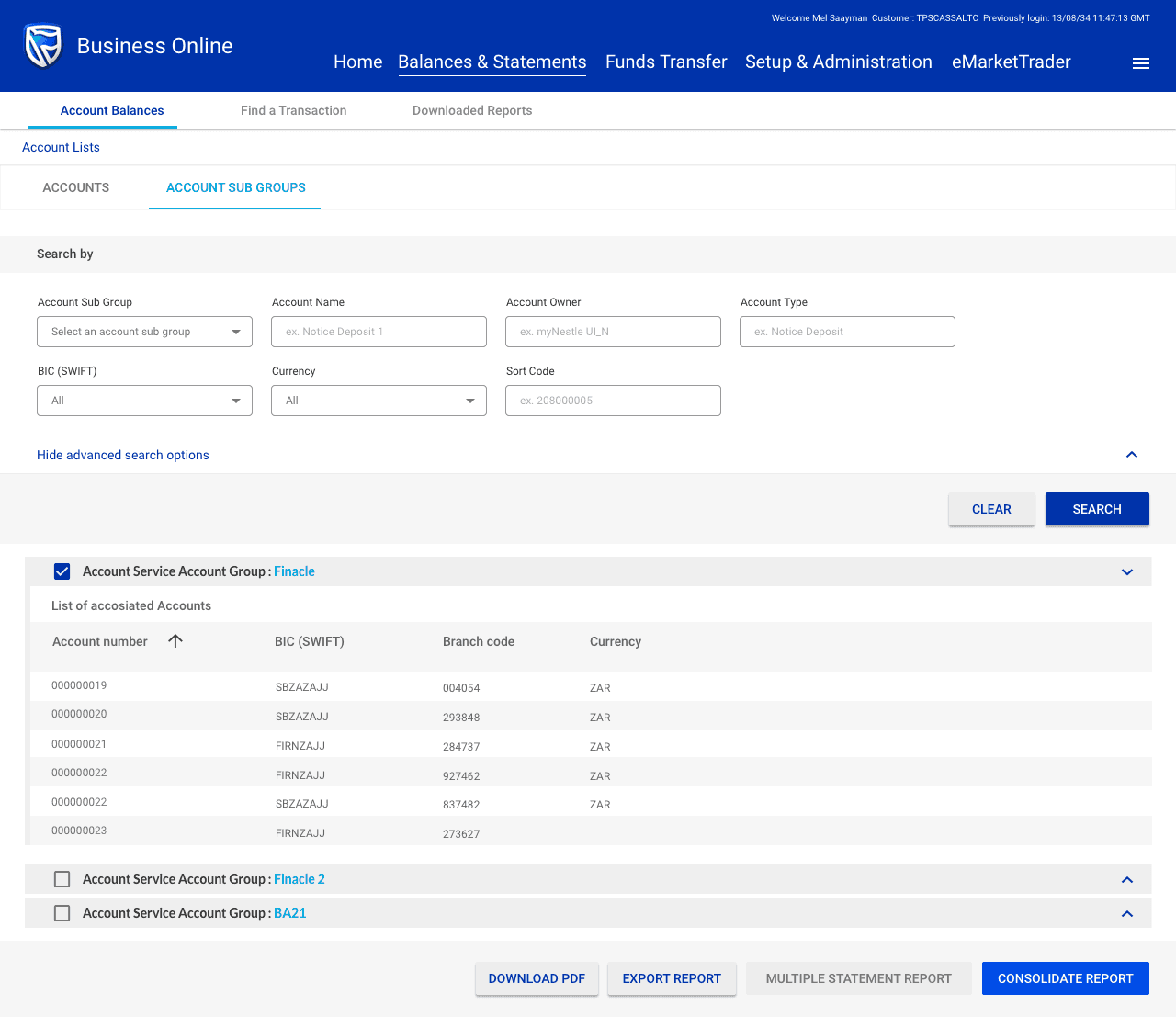
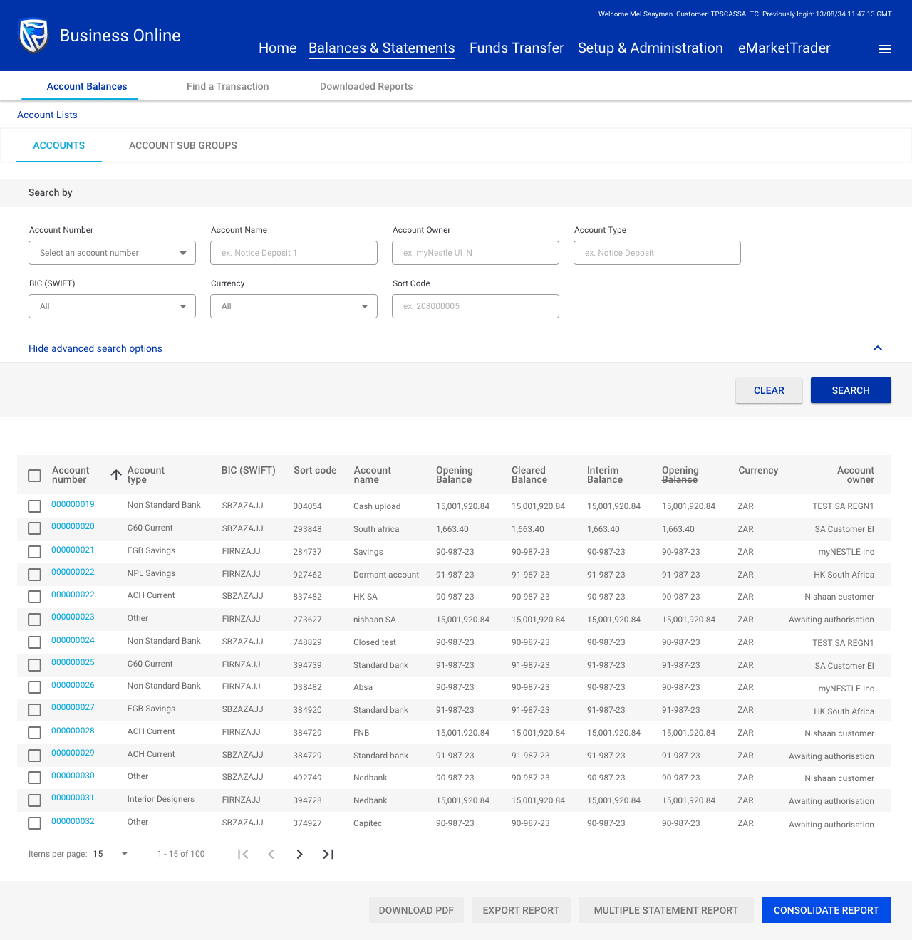
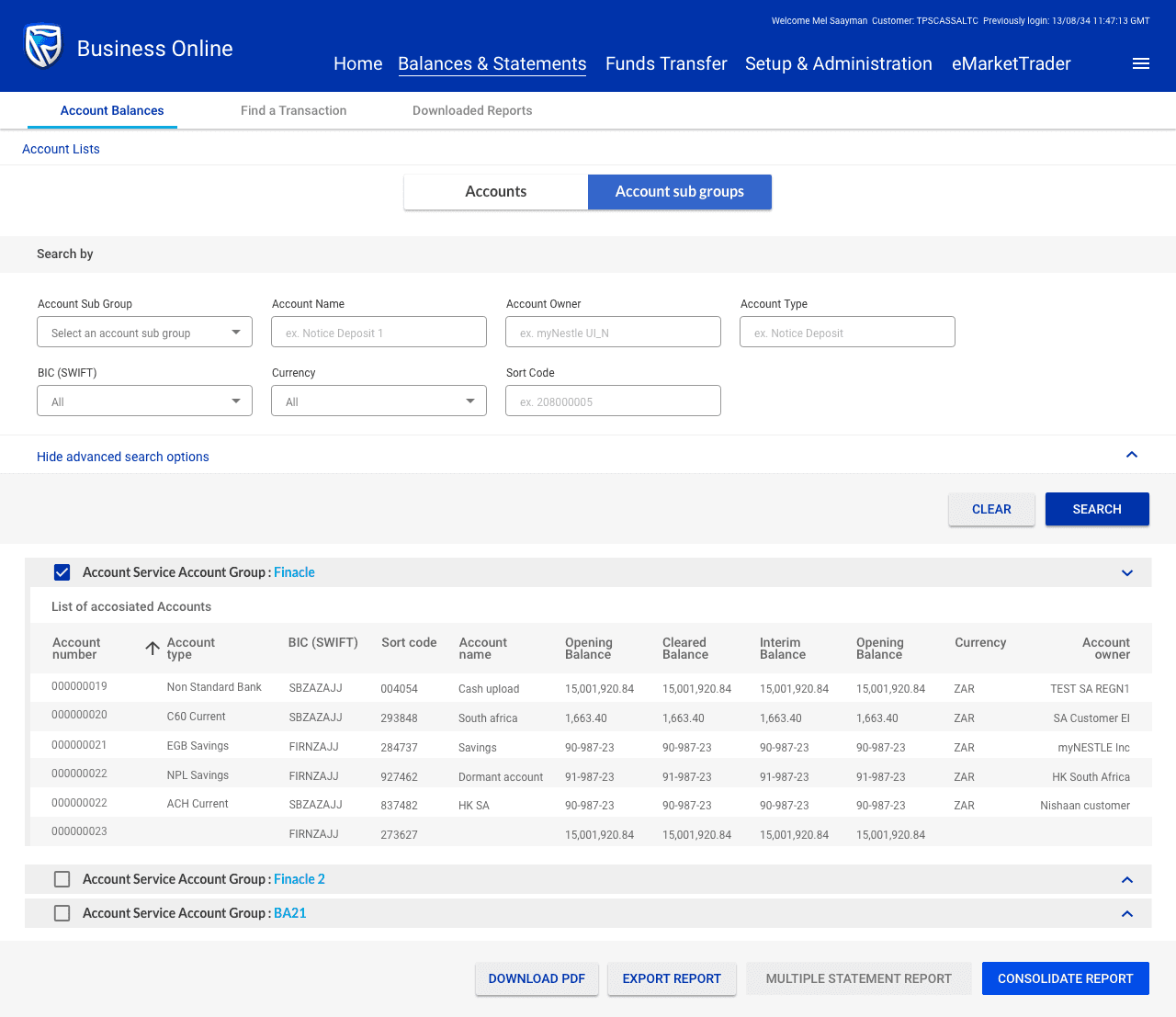
Information Architecture (IA) Restructuring
To address key pain points and support user efficiency, we restructured the IA to be flatter, more predictable, and user-aligned.
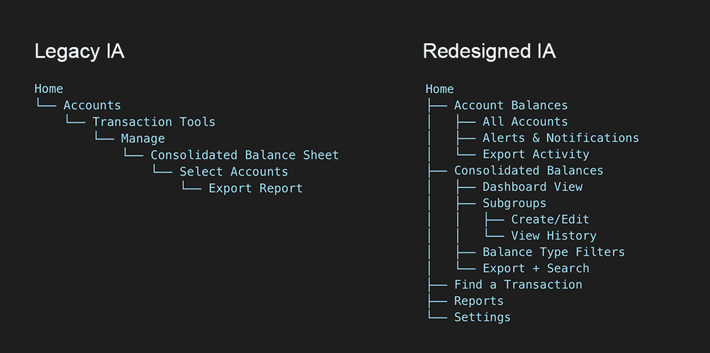
Key Enhancements
We explored two layout approaches to improve usability:
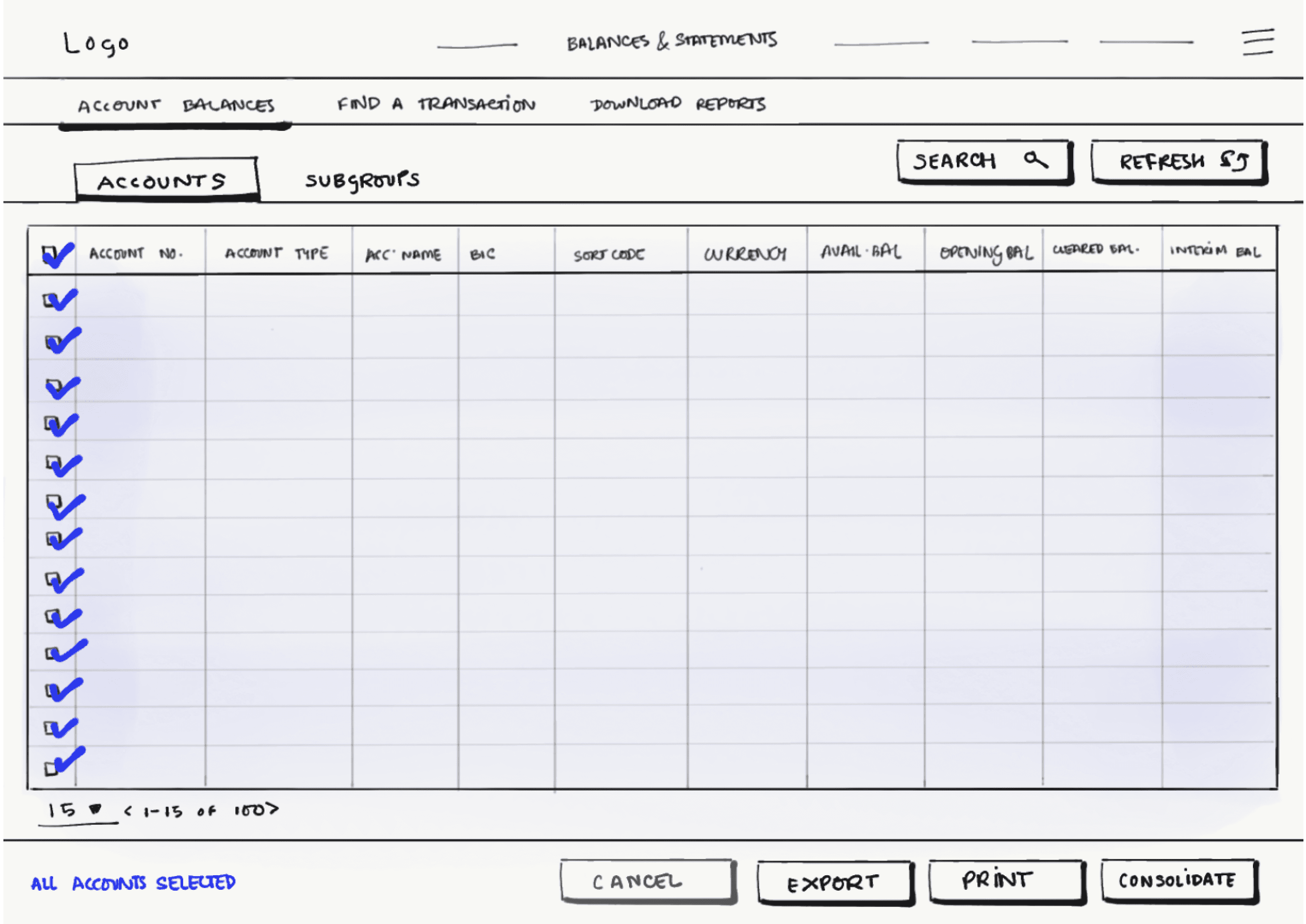
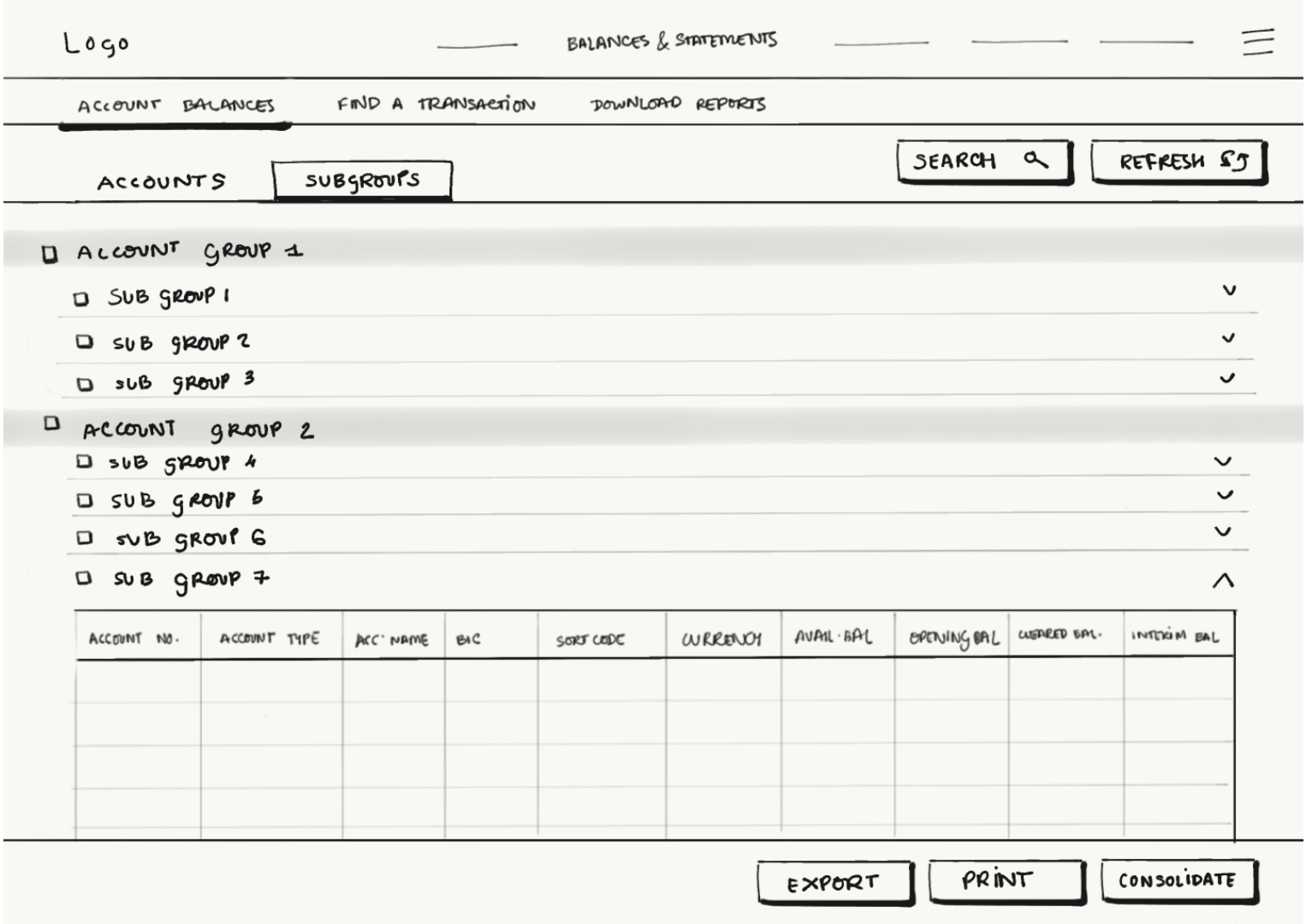
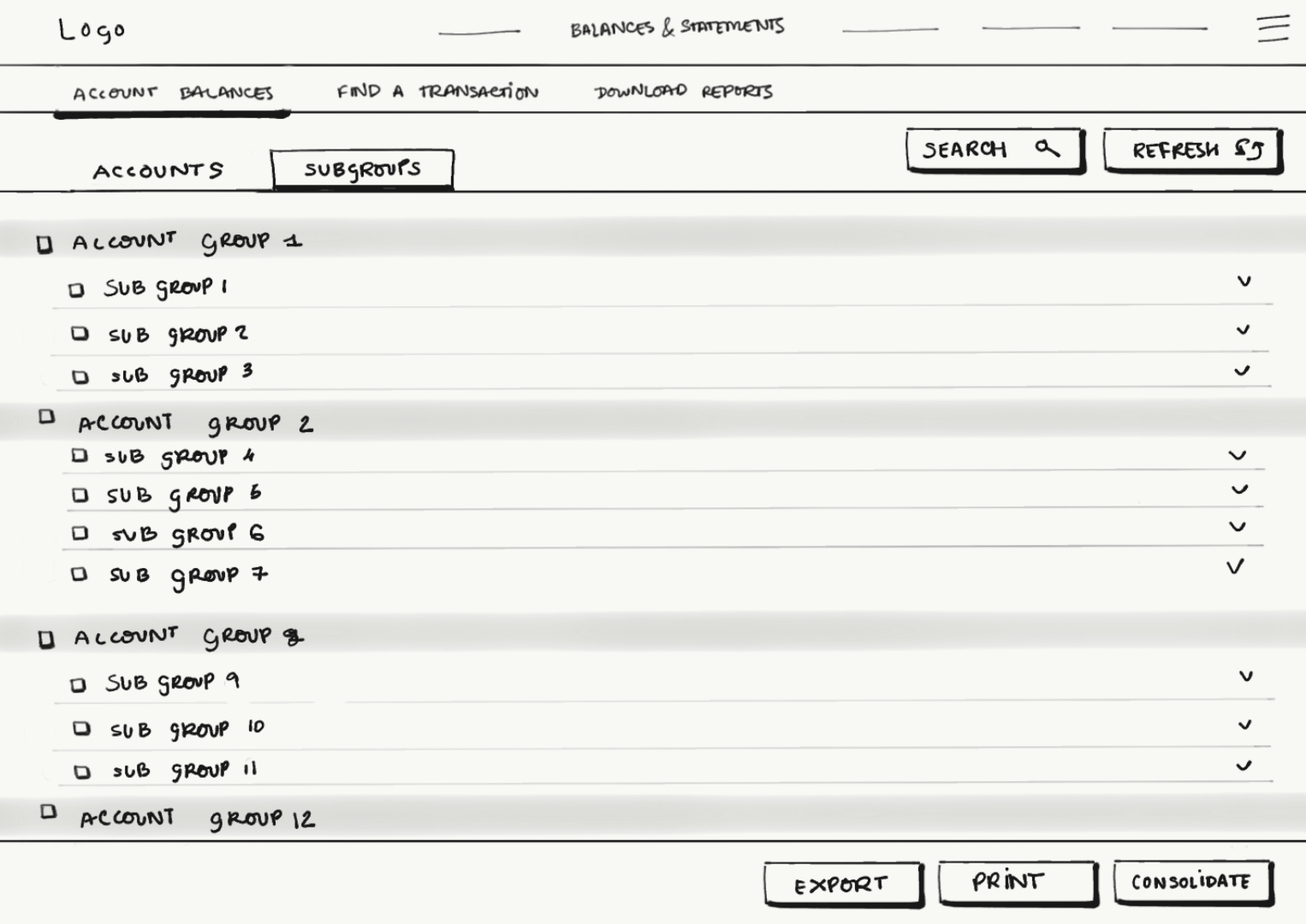
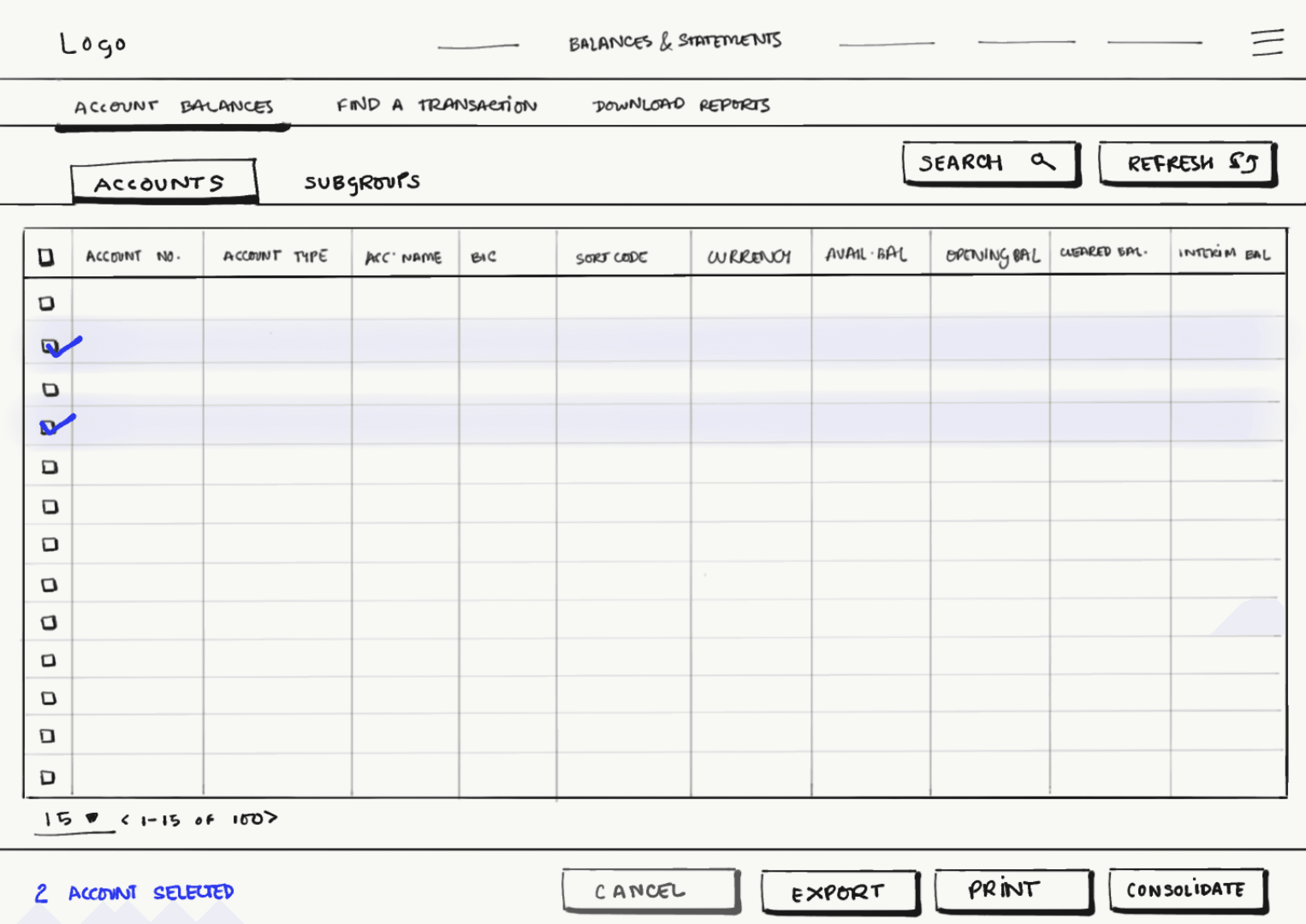
Approach #1
Moved Consolidated Balances to Level 1 nav for direct access
Grouped 'Accounts' and 'Subgroups' under Level 2
Introduced persistent Search and Refresh on screen
Impact: Reduced navigation friction and helped users find data and actions more quickly without switching screens or retracing steps.
1
2
3
1
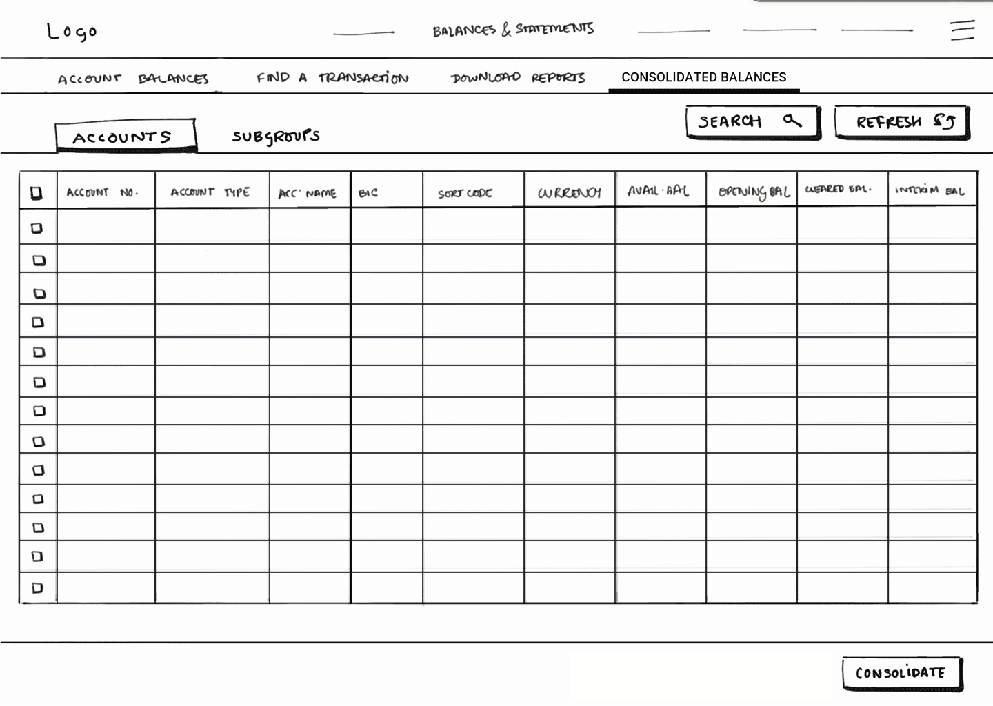
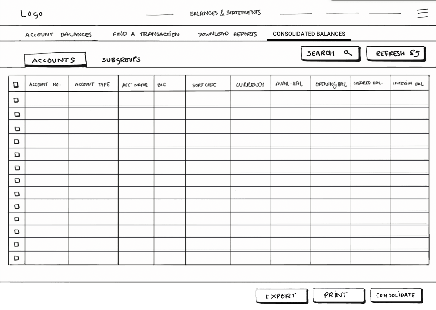
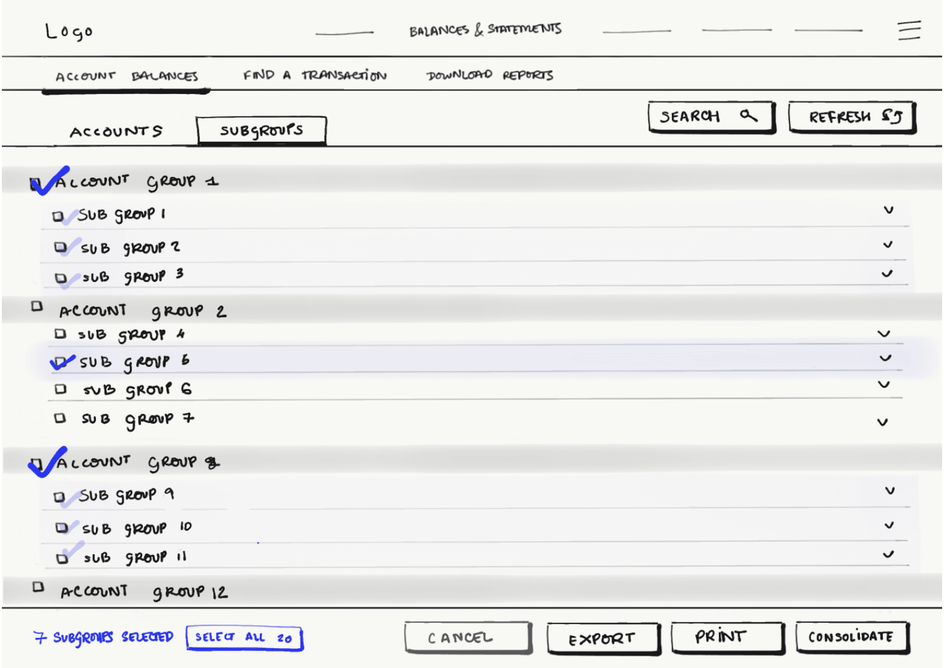
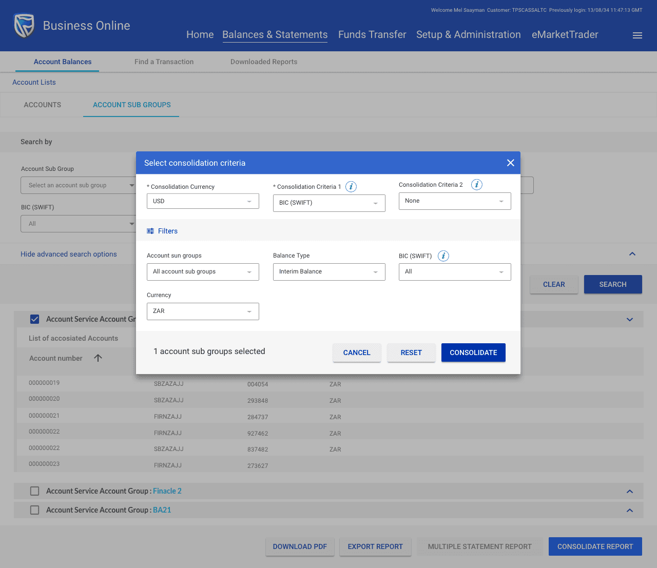
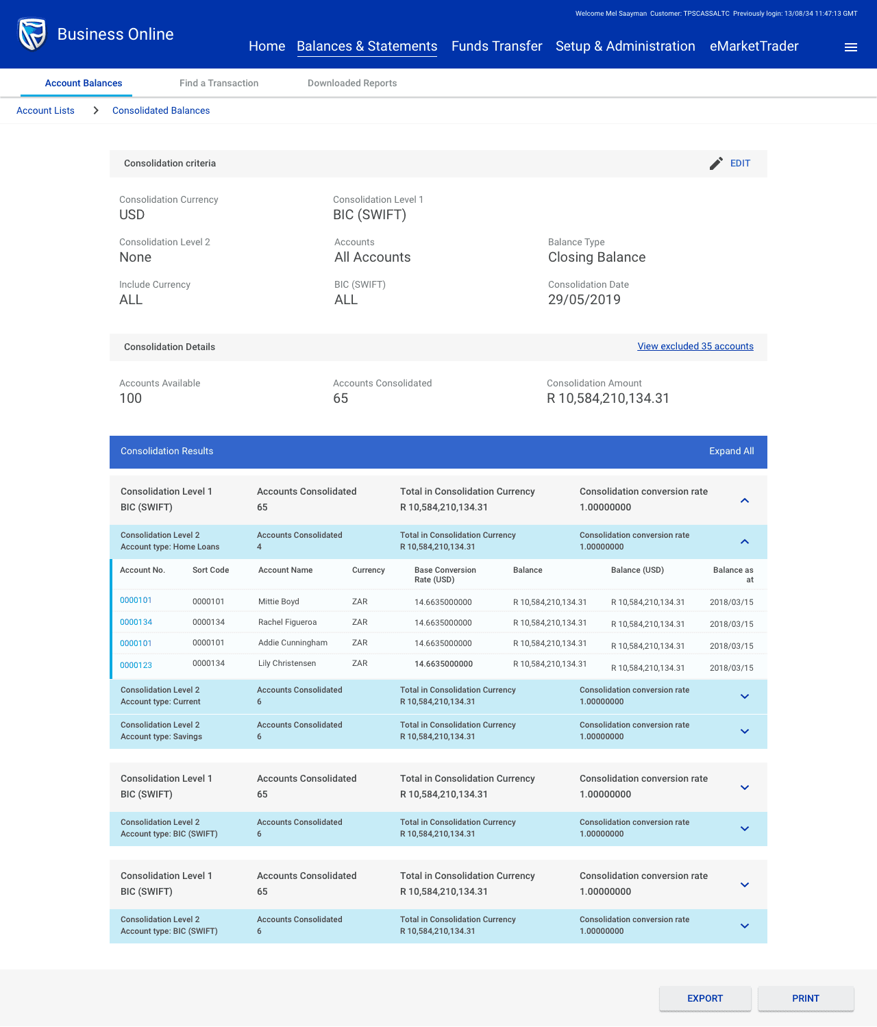
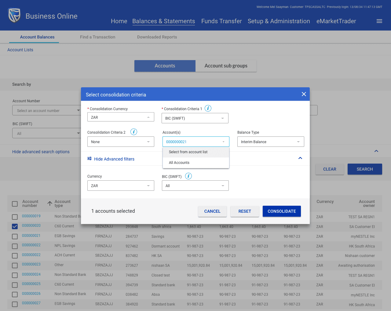
Approach #2
Placed CTAs like Export, Print, and Consolidate upfront and fixed in position
Reduced decision-making steps by aligning CTA placement with users’ mental models
Impact: Helped users complete frequent actions faster by making core CTAs instantly accessible — reducing clicks, time, and cognitive strain. upfront and fixed in position
User Workflow Diagram
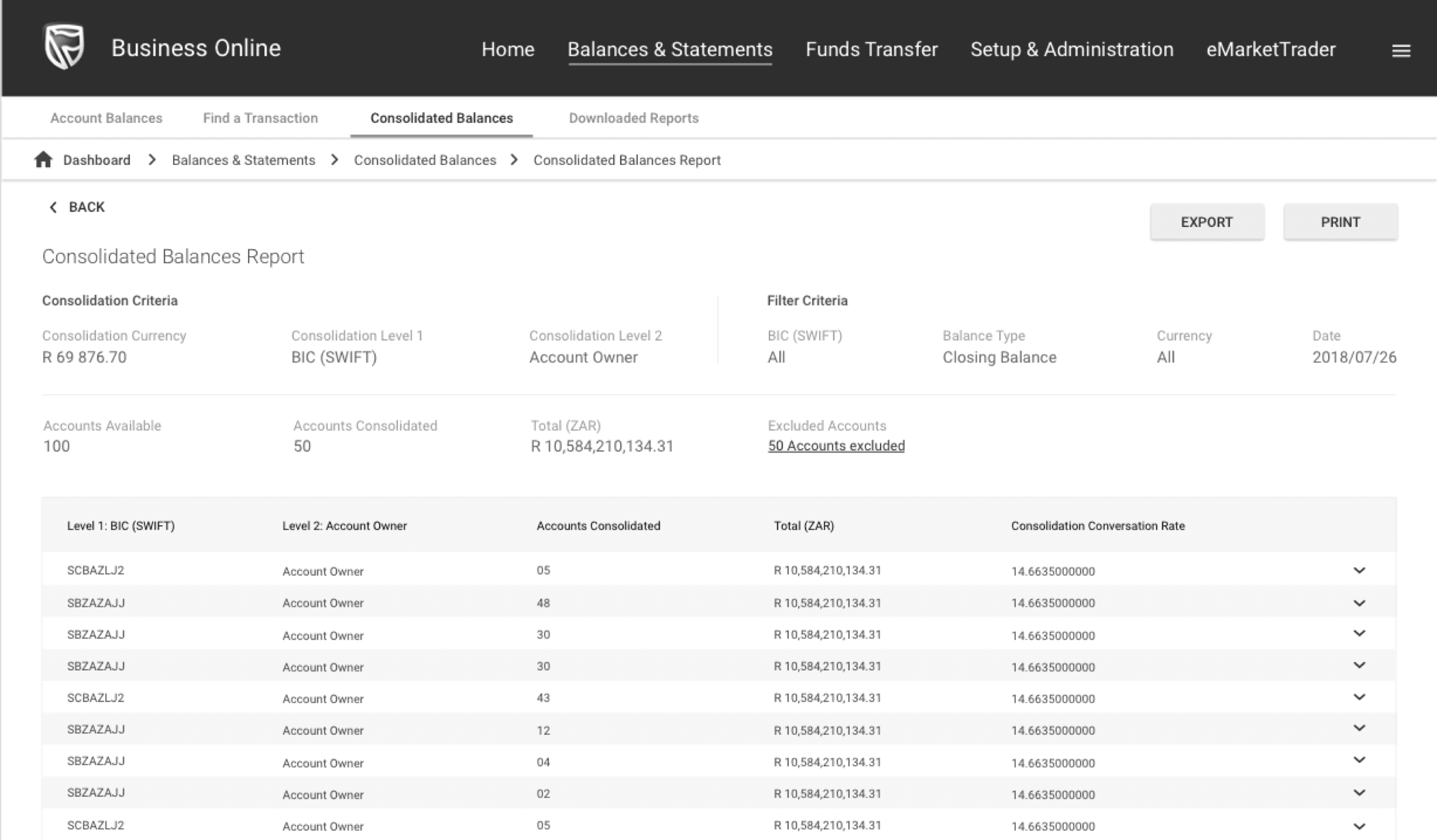
Wireframes

Visual Designs
What We Tested
Objective
Evaluated the new consolidated balances feature in BOL with 30 existing users across 37 video sessions and 14 questionnaire responses.
Summary Results
Overall, the new design changes were well received by participants.
All participants were able to complete the tasks successfully, with an average completion time of 6 minutes and 30 seconds.
6 users bounced before starting the test, the remaining 24 did the following:
Average active time
6 min
Average session time
30 min
Definition of “Success”
User completes user journey
Key Observations
Instead of listing general changes, tie each interface change to a user need or data point:
Convert Outcomes into Actionable Priorities
Instead of listing general changes, tie each interface change to a user need or data point: